Integration 9 block design & features
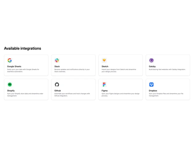
The Integration9 component showcases a curated list of available integrations, providing users with a clear overview of connectivity options. Each integration is presented with a recognizable icon, a title, and a brief description, allowing users to quickly identify the services and platforms that can be seamlessly integrated into their workflow. The component is designed to be visually appealing and easily navigable, ensuring users can comprehend and access the integration features efficiently.
In more detail, the Integration9 component serves as a shadcn block that enhances user interaction by displaying a grid of integration options. The grid layout dynamically adjusts to varying device sizes, accommodating different viewports. Each integration card is interactive, featuring hover effects to engage users. The component is customizable, allowing for modifications in titles and integration data, which provides versatility for different application requirements. Through its organized presentation and adjustable design, this shadcn component is an essential part of enhancing user experience and accessibility when dealing with multiple service integrations.