Integration 7 block design & features
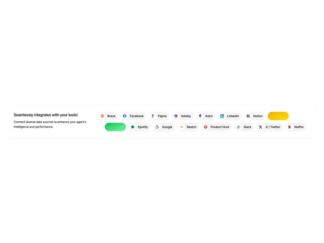
The Integration7 component displays a visually appealing integration block, showcasing a variety of app logos and custom styles. Designed to feature seamless integration capabilities, this shadcn block graphically represents how a platform or agent can connect with multiple external tools and services. Featuring a diverse range of recognizable brand icons, it serves as a powerful visual cue of the interoperability potential.
This component consists of two main sections: an explanatory text area and an icon display grid. The text area outlines the purpose of the integrations, while the icon grid uses a flexible, responsive layout to present a curated list of application logos. Each icon in the grid is displayed within a rounded container, and the component skillfully displays either the brand logo or a distinguishable color gradient style, depending on available data. It effectively uses elements of the shadcn UI to create an immersive user experience that captures attention.