
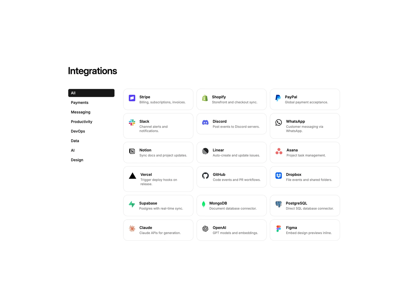
Integration 32 block design & features
Integration32 is a catalog with a sidebar, built with Shadcn UI Button, Dialog, Input, Label, and Select. A heading introduces a two-column layout: category nav on the left and a card grid on the right. Clicking a category filters the grid. Each card shows a logo, name, and one-line description. Clicking a card opens a dialog with that tool's logo, a webhook URL field, a sandbox or production environment select, and cancel or connect actions.
The sidebar uses a filled Button for the active item and ghost for the rest. Cards are bordered with a muted hover fill. Density is medium rather than a logo-only cloud. Switching categories does not collapse the section: the grid keeps the height of the full list and cards stay their original size. The dialog is a single column with a small bordered logo tile above the title. After connecting, the footer switches to disconnect and done.
This is a directory pattern with working navigation and a connect step. Complexity is moderate and mixed: layout plus a filterable list of partners and per-tool webhook settings.
On small screens the nav wraps horizontally above a one-column grid, then two, then three. The dialog stays a single column.