
Integration 11 block design & features
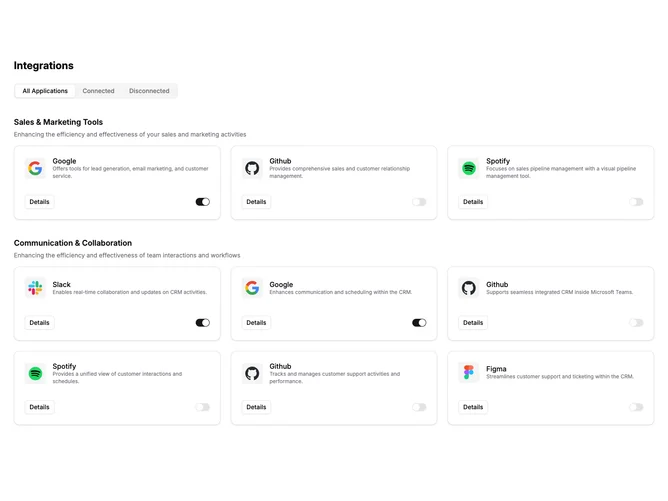
Integration11 is a full-width section using shadcn/ui Tabs to filter integrations by connection status. Tabs include All Applications, Connected, and Disconnected. Below the tabs, integrations are grouped by category with a category heading and description. Each integration appears as a bordered card with an icon inside a muted square, a title, description, an outline Button for details, and a Switch toggle for connection state.
Cards are arranged in a responsive grid up to three columns. Each card has rounded corners, a light border, subtle shadow, and a hover shadow transition. Icons sit in a muted background container. Text uses standard foreground color for titles and muted-foreground for descriptions. Spacing between category groups is generous.
This follows a functional dashboard pattern with interactive state management. The tabbed filtering and per-card toggles create a moderate level of interactivity. The visual style is clean and utilitarian, prioritizing information density over decoration.
On mobile, the grid reduces to a single column and the cards maintain their full internal layout.