
Integration 20 block design & features
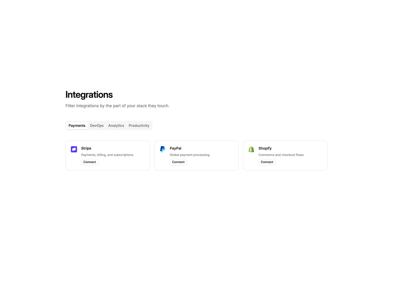
Integration20 is a categorized catalog built with shadcn/ui Tabs, Dialog, Input, Select, Label, and Button. A heading and supporting copy introduce category tabs for payments, DevOps, analytics, and productivity. Each tab shows a grid of cards with a logo, name, short description, and a compact outline connect button. Clicking connect opens a dialog with that tool's logo, a workspace URL field, a sandbox or production environment select, and cancel or connect actions.
Tabs use the default shadcn tab group. Cards are bordered and compact. Switching categories does not change the section height: the grid stays as tall as the largest tab and extra space sits under the cards. The dialog is a single column with a small bordered logo tile above the title. After connecting, the card button switches to a connected state and the dialog can disconnect.
This is a practical directory rather than a logo strip. Complexity is moderate and mixed: tab filtering plus a working connect form for each tool.
On small screens tabs wrap and the grid drops to one column, then two, then three. The dialog stays a single column.