
Integration 10 block design & features
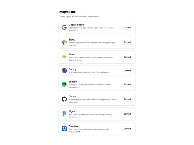
Integration10 is a vertically stacked list of eight integration items within a narrow centered container. Each item shows an app icon, a title, and a short description on the left, with a Shadcn UI outline Button labeled "Connect" on the right. A small heading and subtitle sit above the list.
Each row uses a rounded border with a subtle box shadow on a white background. Text is dark with muted secondary descriptions. Spacing between rows is consistent with moderate vertical gaps. No animations or hover effects beyond basic button styling.
The design follows a minimal settings-panel aesthetic. It reads like an account integrations page rather than a marketing showcase. Complexity is low with a single repeated row pattern and no decorative elements.
On mobile, the icon, text, and button stack vertically within each row rather than sitting side by side.