Integration 5 block design & features
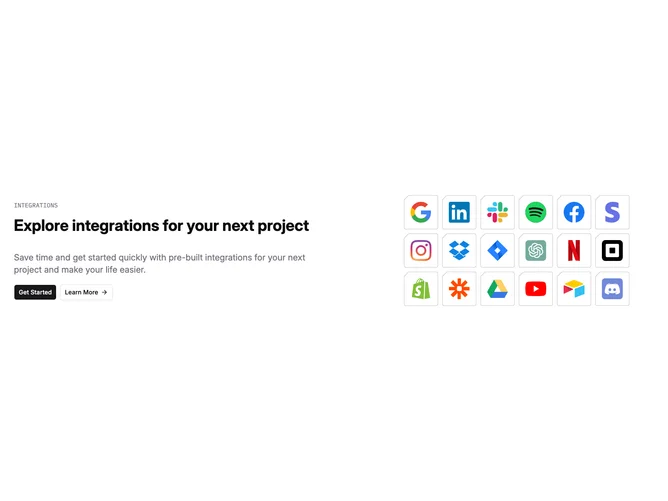
The Integration5 component presents a visually engaging section that showcases various pre-built integrations designed to help users get started quickly on their projects. This component features an intuitive layout, offering a clean and polished interface for displaying integration options through a combination of text and icon imagery. The layout efficiently splits the content between a text description and a visually appealing representation of integration icons, balancing information delivery with visual aesthetics.
Diving deeper, this shadcn block uses a two-column layout to effectively present both descriptive text and a gallery of integration logos. The left column introduces the concept of integrations, encouraging users to explore options with impactful text and call-to-action buttons, while the right column displays a grid of integration logos that are rendered using a map function iterating through an images array. The combination of buttons, icons, and structured text creates a seamless user experience, enhanced by a focused design that emphasizes simplicity and usability, making it a valuable asset in the library of any project utilizing shadcn ui components.