

Compare 7 block design & features
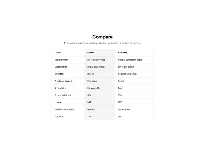
Compare7 is a centered documentation-style table built with shadcn/ui. A large heading and muted description introduce a max-width table with three columns: feature name, primary framework column on a muted background, and secondary framework text. Rows cover design system posture, customization, built-in theme support, TypeScript depth, accessibility emphasis, component counts, license parity, premium add-ons, and design kit availability. Where the secondary answer needs context, the cell shows underlined dotted text that opens a tooltip with a title and short paragraph.
The table uses rounded outer corners, a light border, and left-aligned body copy with semibold header cells. Spacing is comfortable and the middle column reads as the recommended column through background fill rather than loud color.
The block is straightforward and highly reusable: swap labels, rows, and tooltip copy to compare any pair of tools. It stays minimal and informational, closer to a product FAQ excerpt than a marketing collage.
Horizontal overflow is contained with an auto scroll wrapper so the table survives narrow layouts without breaking column alignment.