Feature 203 block design & features
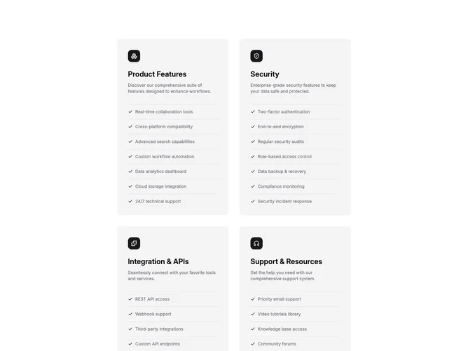
Feature203 is a dense comparison grid built with Shadcn UI. Four cards appear in a two-by-two rhythm on desktop; each opens with an icon and title, adds a short paragraph, then stacks several checklist lines marked with small confirm glyphs. Separator components break the list into readable bands instead of one uninterrupted wall of text.
Card styling stays neutral with light surfaces, hairline dividers between checklist entries, and restrained hover feedback that may lift shadow slightly. Icons align to a predictable corner so repeated scanning down a row feels mechanical in a helpful way. Typography emphasizes headline, then body, then list labels at smaller size.
Complexity is moderate-to-high on the content side because each card carries both prose and multiple list items. The block suits packaging four related offerings where readers expect detail parity. The visual language is corporate-modern and orderly rather than playful.
On small screens the two-column grid stacks into a single column so each checklist still spans full width.