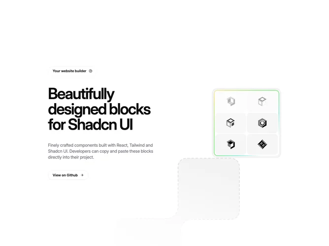
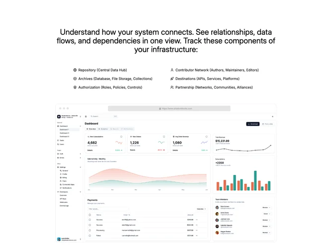
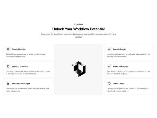
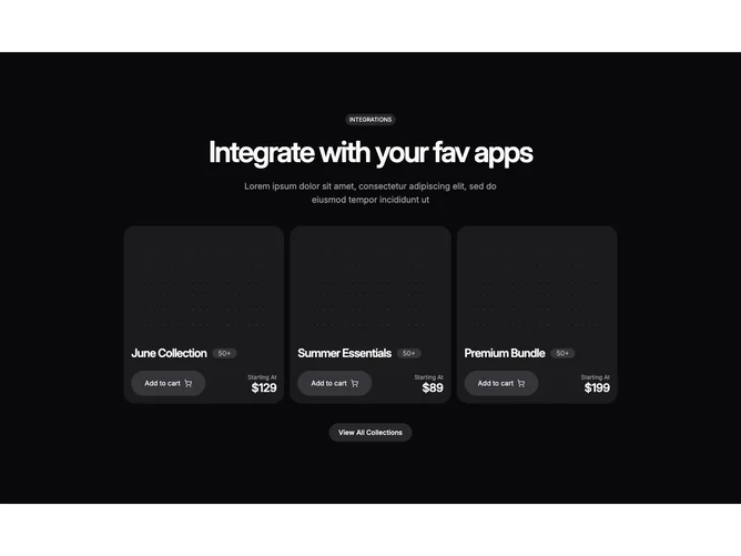
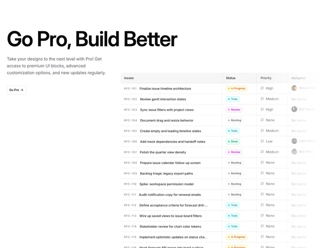
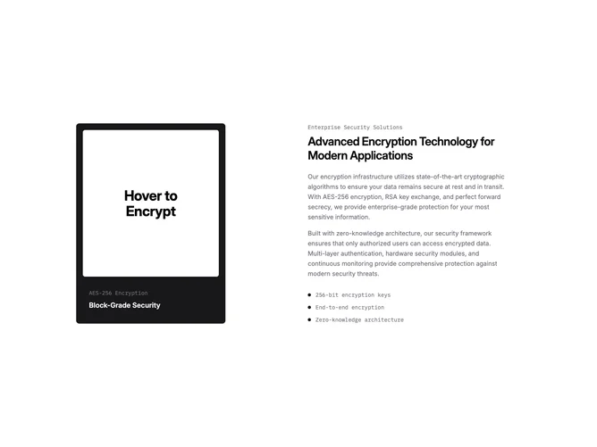
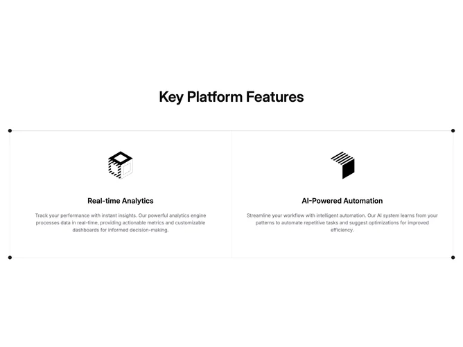
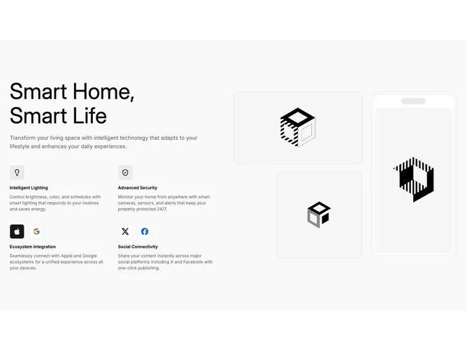
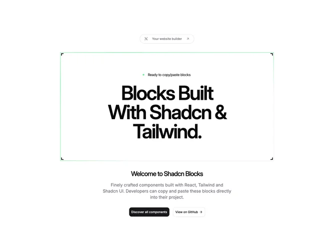
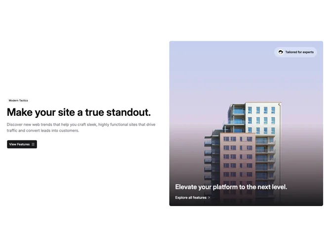
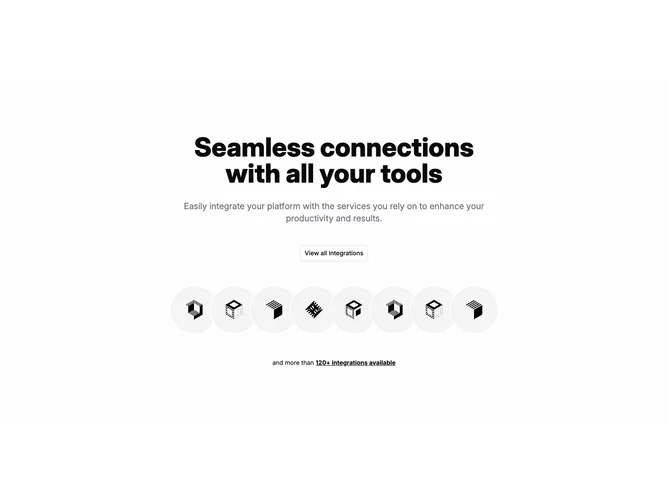
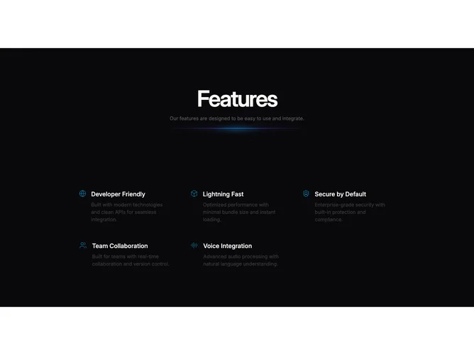
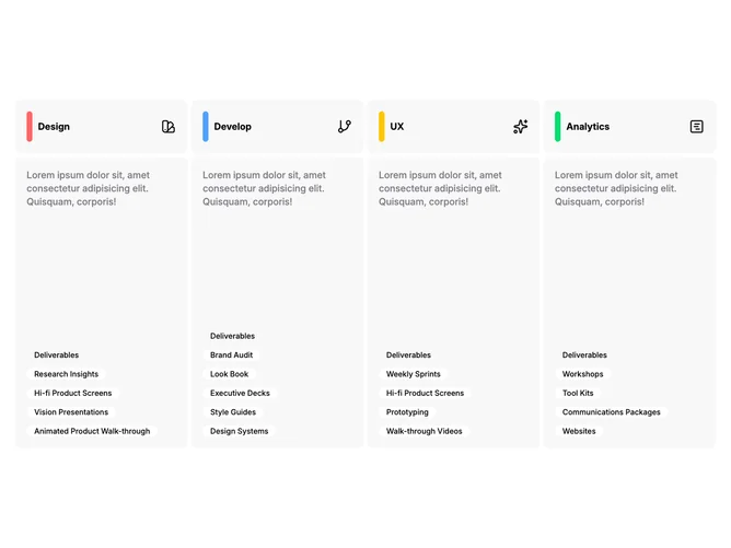
Shadcn Feature Other Blocks

Browse and download 84+ Shadcn UI Feature Other blocks. Built with React, Tailwind and shadcn/ui. These shadcn components are ready to download, copy and paste or install with the shadcn registry.

Shadcn Feature 287 - Glowing star cards in a responsive grid

Glowing star cards in a responsive grid

Shadcn Feature 44 - Integration cards with square logos

Integration cards with square logos

Shadcn Feature 203 - Four feature cards with checklist rows

Four feature cards with checklist rows

Shadcn Feature 271 - Full-height feature list on aurora backdrop

Full-height feature list on aurora backdrop

Shadcn Feature 152 - Centered headline with staggered icon badges

Centered headline with staggered icon badges

Shadcn Feature 150 - Two-column CRM panels with hover imagery

Two-column CRM panels with hover imagery

Shadcn Feature 219 - Patterned feature columns with three image layouts

Patterned feature columns with three image layouts

Shadcn Feature 289 - Split headline and link-preview stack list

Split headline and link-preview stack list

Shadcn Feature 62 - Three alternating image-and-text rows

Three alternating image-and-text rows

Shadcn Feature 285 - Brand column beside dual vertical image marquees

Brand column beside dual vertical image marquees

Shadcn Feature 250 - Animated network illustration with linked CPU nodes

Animated network illustration with linked CPU nodes

Shadcn Feature 241 - Team features grid with icon cards

Team features grid with icon cards

Shadcn Feature 239 - Split feature with dotted frame and image tile

Split feature with dotted frame and image tile

Shadcn Feature 274 - Metrics grid with canvas hover reveals

Metrics grid with canvas hover reveals

Shadcn Feature 251 - Four feature cards with globe and animated beams

Four feature cards with globe and animated beams

Shadcn Feature 190 - Dense feature grid with square thumbnails

Dense feature grid with square thumbnails

Shadcn Feature 288 - Centered copy with inline link previews

Centered copy with inline link previews

Shadcn Feature 137 - Image-forward value cards and icon rows

Image-forward value cards and icon rows

Shadcn Feature 221 - Feature grid with badges and gradient dots

Feature grid with badges and gradient dots

Shadcn Feature 217a - Centered hero band over three accessibility columns

Centered hero band over three accessibility columns

Shadcn Feature 217b - Frosted accessibility tiles on photo backdrop

Frosted accessibility tiles on photo backdrop

Shadcn Feature 80 - Square image beside text and dual action links

Square image beside text and dual action links

Shadcn Feature 8 - Centered heading with two framework cards

Centered heading with two framework cards

Shadcn Feature 79 - Featured media card with compact link rows

Featured media card with compact link rows

Shadcn Feature 238 - Giant headline with layered browser cards

Giant headline with layered browser cards

Shadcn Feature 4 - Collaboration feature with cards and quote

Collaboration feature with cards and quote

Shadcn Feature 189 - Split feature list with layered images

Split feature list with layered images

Shadcn Feature 220a - Centered section with video and stats

Centered section with video and stats

Shadcn Feature 55 - Centered feature with headline and outline button

Centered feature with headline and outline button

Shadcn Feature 255 - Top contributors list with header actions

Top contributors list with header actions

Shadcn Feature 53 - Numbered logo matrix with hairline grid

Numbered logo matrix with hairline grid

Shadcn Feature 200 - Three gradient panels with icon feature lists

Three gradient panels with icon feature lists

Shadcn Feature 237 - System capability cards with dense metrics

System capability cards with dense metrics

Shadcn Feature 235 - Split promo with flicker tiles and shine border

Split promo with flicker tiles and shine border

Shadcn Feature 74 - Split intro with two large feature panels

Split intro with two large feature panels

Shadcn Feature 245 - Two-column feature list with center image

Two-column feature list with center image

Shadcn Feature 230 - Wide hero image with split headline and icons

Wide hero image with split headline and icons

Shadcn Feature 299 - System pillars list with centered copy and browser mockup

System pillars list with centered copy and browser mockup

Shadcn Feature 104 - Three-column icon highlights with center image

Three-column icon highlights with center image

Shadcn Feature 120 - Split proof header with stat strip

Split proof header with stat strip

Shadcn Feature 21 - Two-column grid of utility cards

Two-column grid of utility cards

Shadcn Feature 286 - Product collection cards with glowing stars

Product collection cards with glowing stars

Shadcn Feature 229 - Three pillars with icon headers and checklists

Three pillars with icon headers and checklists

Shadcn Feature 41 - Split heading with four city addresses

Split heading with four city addresses

Shadcn Feature 254 - Orbiting avatar rings with center headline and CTA

Orbiting avatar rings with center headline and CTA

Shadcn Feature 270 - Three tilted panels with alternating image stacks

Three tilted panels with alternating image stacks

Shadcn Feature 154 - Dual marquee rows of workflow badges

Dual marquee rows of workflow badges

Shadcn Feature 75 - Text column beside three linked feature tiles

Text column beside three linked feature tiles

Shadcn Feature 292 - Hiring band with pointer highlight and signup column

Hiring band with pointer highlight and signup column

Shadcn Feature 82 - Integration grid with top headline row and separator

Integration grid with top headline row and separator

Shadcn Feature 253 - Split feature with globe and animated arrow button

Split feature with globe and animated arrow button

Shadcn Feature 257 - Curated tool catalog with tiered card sizes

Curated tool catalog with tiered card sizes

Shadcn Feature 234 - Centered headline with fanned image cards

Centered headline with fanned image cards

Shadcn Feature 183 - Device-stage hero with overlay cards and stats

Device-stage hero with overlay cards and stats

Shadcn Feature 22 - Checklist header with three outline showcase cards

Checklist header with three outline showcase cards

Shadcn Feature 161 - Bordered grid with logos rail

Bordered grid with logos rail

Shadcn Feature 147 - Integration matrix with split hero text

Integration matrix with split hero text

Shadcn Feature 256 - Developer tools grid and guides with spotlight cards

Developer tools grid and guides with spotlight cards

Shadcn Feature 218 - Split upgrade column with soft-fade photo edge

Split upgrade column with soft-fade photo edge

Shadcn Feature 282 - Security story beside interactive encrypt card

Security story beside interactive encrypt card

Shadcn Feature 77 - Two-up feature grid with corner dots

Two-up feature grid with corner dots

Shadcn Feature 228 - Smart home story with icon grid and gallery

Smart home story with icon grid and gallery

Shadcn Feature 217 - Accessibility story with hero image and icon columns

Accessibility story with hero image and icon columns

Shadcn Feature 252 - Ripple panel with dashed border and primary CTA

Ripple panel with dashed border and primary CTA

Shadcn Feature 198 - Three icon cards on staggered rows

Three icon cards on staggered rows

Shadcn Feature 136 - Metrics, narrative, and triad of benefit cards

Metrics, narrative, and triad of benefit cards

Shadcn Feature 246 - Email signup panel with benefit checklist

Email signup panel with benefit checklist

Shadcn Feature 107 - Integration grid with linked cards

Integration grid with linked cards

Shadcn Feature 25 - Three feature bands with checkmark grids

Three feature bands with checkmark grids

Shadcn Feature 236 - Bracket-framed headline with ping indicator

Bracket-framed headline with ping indicator

Shadcn Feature 267 - Split feature with subscribe field and 3D marquee

Split feature with subscribe field and 3D marquee

Shadcn Feature 295 - Filtered project grid with categories and roles

Filtered project grid with categories and roles

Shadcn Feature 121 - Interactive grid squares with expanding copy

Interactive grid squares with expanding copy

Shadcn Feature 24 - Compact promo row with headline split and banner image

Compact promo row with headline split and banner image

Shadcn Feature 176 - Two-pane analytics vignette with chart

Two-pane analytics vignette with chart

Shadcn Feature 109 - Split copy with framed photo overlay

Split copy with framed photo overlay

Shadcn Feature 294 - Five-up icon grid on sparkle field

Five-up icon grid on sparkle field

Shadcn Feature 65 - Four expandable columns with color rails

Four expandable columns with color rails

Shadcn Feature 348 - Serif Promo Feature With Left Image

Serif Promo Feature With Left Image

Shadcn Feature Other Blocks

A shadcn feature other block covers unique and creative feature layouts that go beyond standard patterns. These sections offer distinctive approaches for feature content that doesn’t fit neatly into other subcategories.

Each block is a self-contained React component which you can copy/paste the code or install via the shadcn CLI. You own the code — customize the layout, content, and styling using Tailwind utility classes.