

Feature 136 block design & features
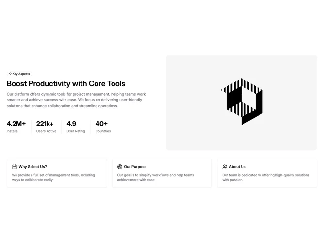
Feature136 combines proof points and explanation in one section built with shadcn/ui. The upper area is a two-column grid: one side presents an outline badge with a trophy icon, a large heading, a paragraph, and a row of four bold statistics separated by vertical rules; the opposite side shows a tall rounded photograph. Below that, a three-column band repeats smaller bordered cards, each pairing a line icon with a short title and muted description.
Typography is headline-forward on the left, with oversized numerals for the metrics and hairline separators keeping the quartet legible. Imagery sits in a simple rounded frame without extra matting. The lower cards share the same border language but shrink the hierarchy to supportive blurbs.
The aesthetic reads as contemporary marketing with a slight enterprise sheen: structured numbers up top, friendly iconography underneath. Complexity is moderate because you must supply credible metrics, a strong photo, and three concise benefit ideas for the footer row to feel intentional.
Responsive behavior reflows the stat row and stacks the image beneath or beside the narrative depending on width, while the three benefit cards drop from a row to a single column on the smallest screens.