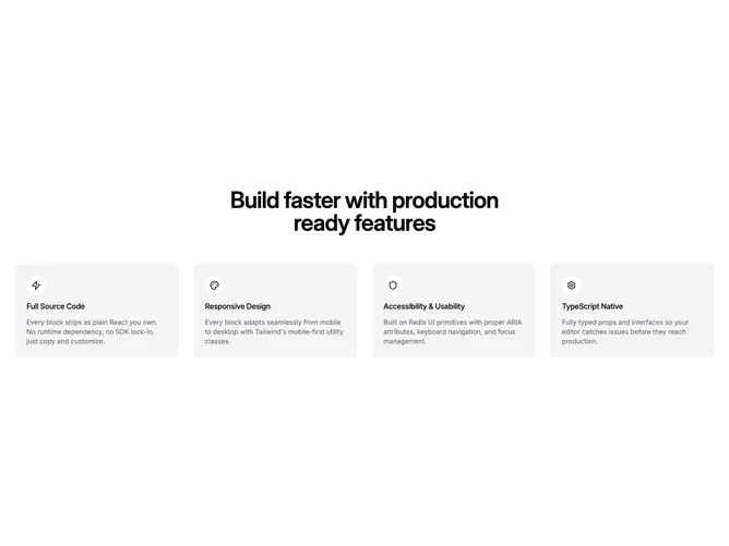
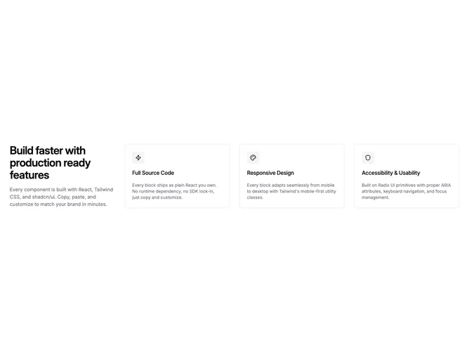
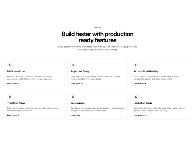
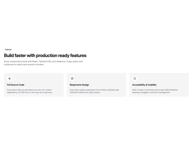
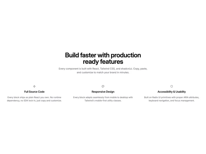
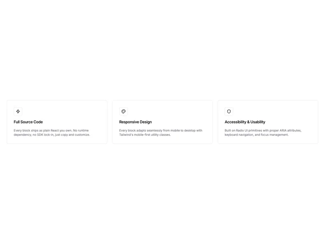
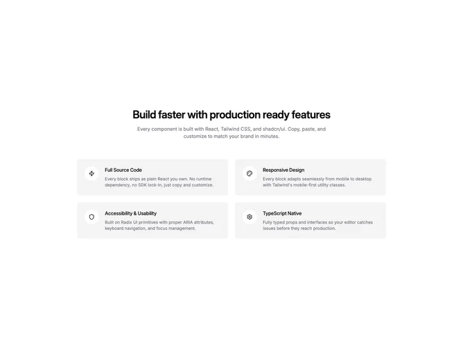
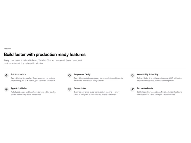
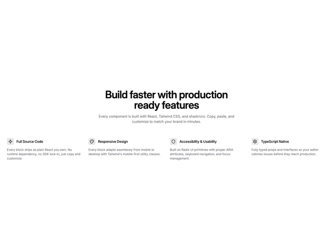
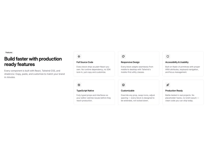
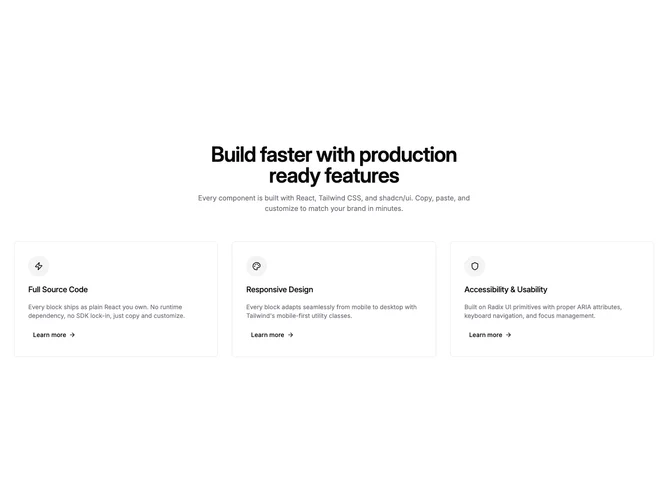
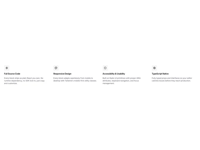
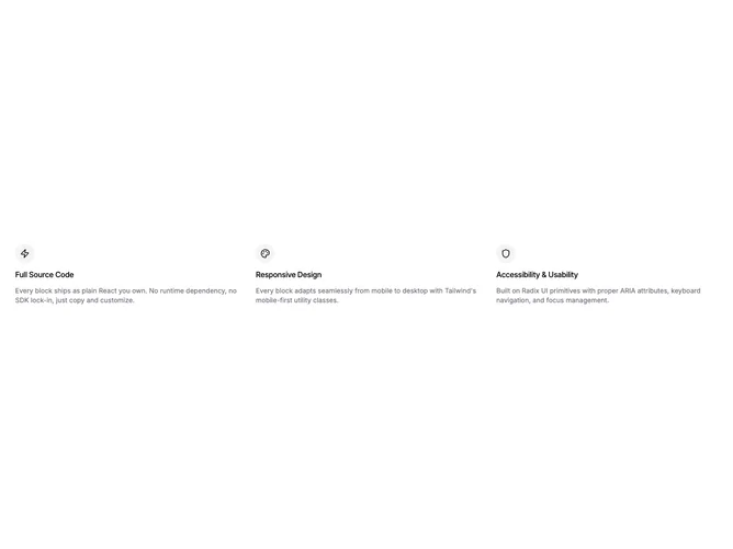
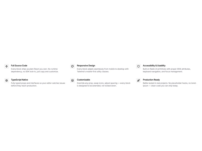
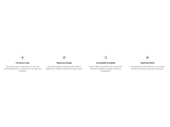
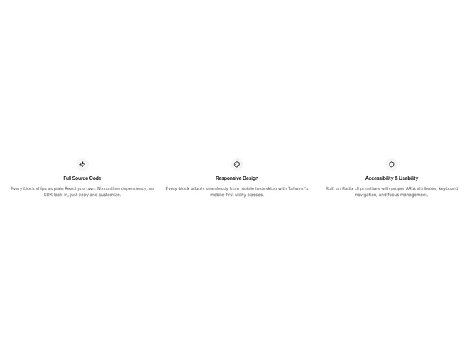
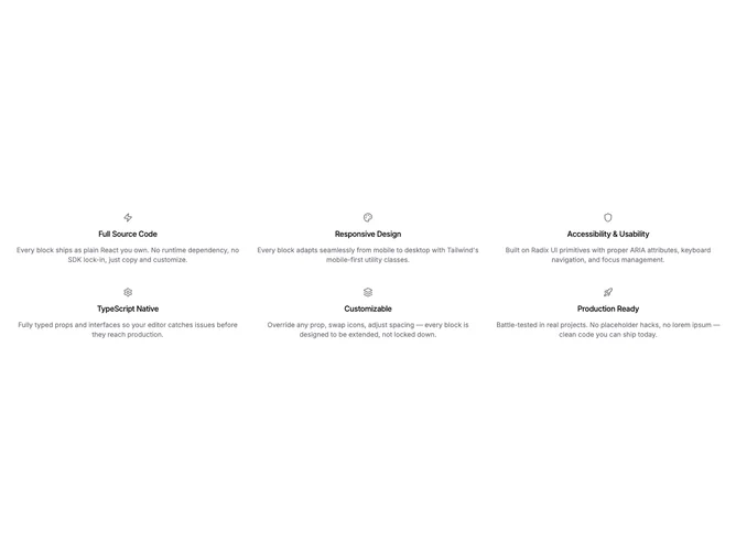
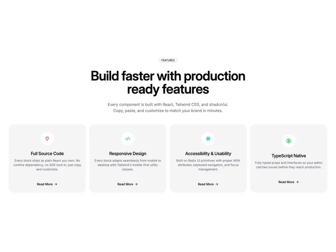
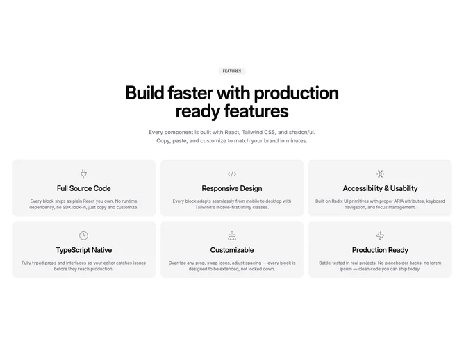
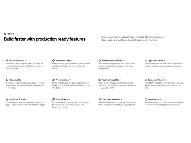
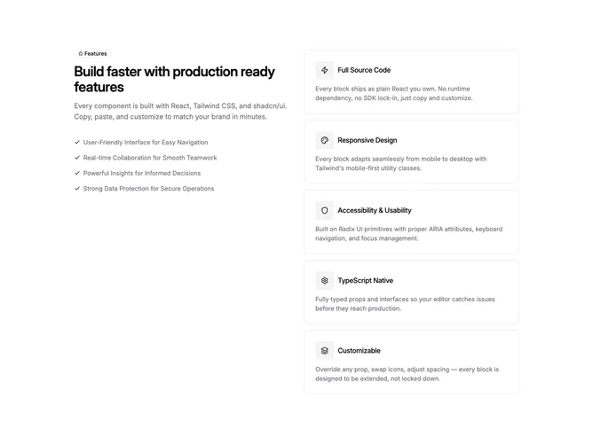
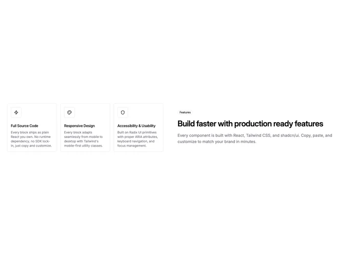
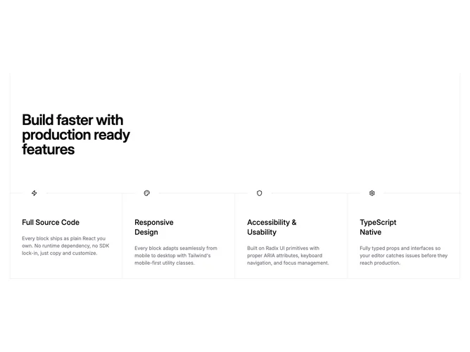
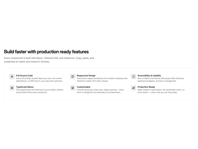
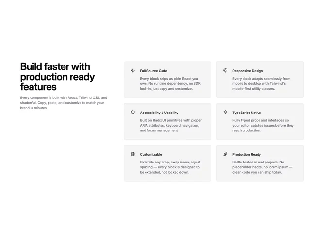
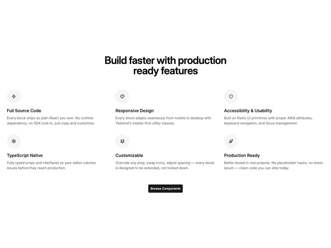
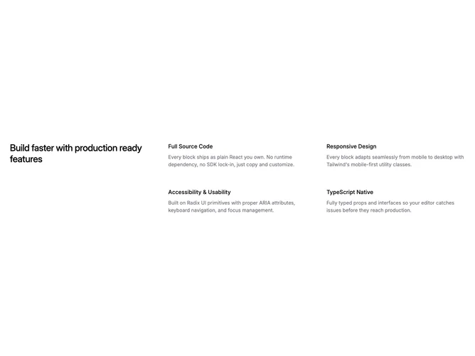
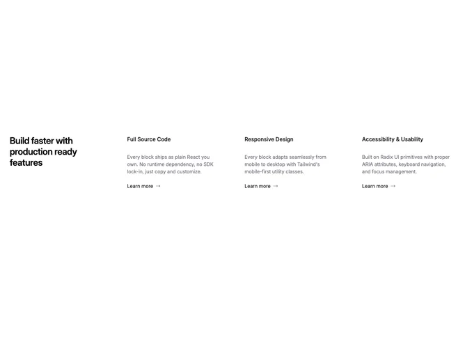
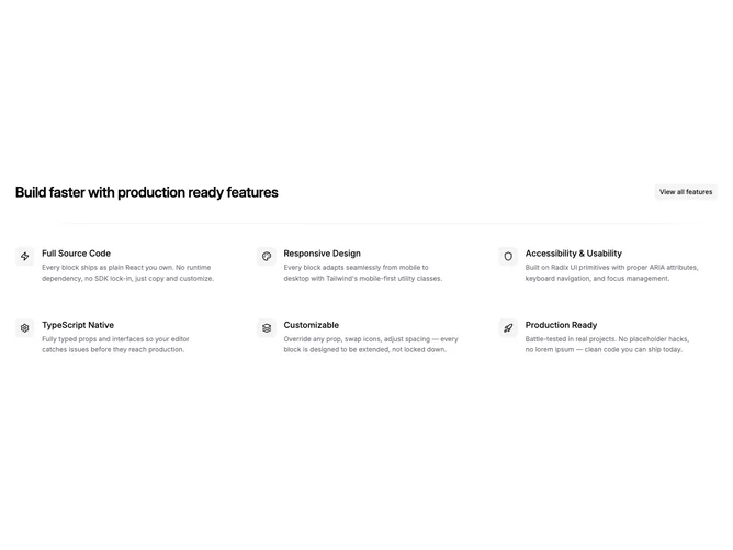
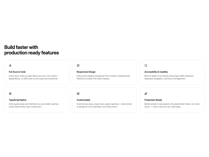
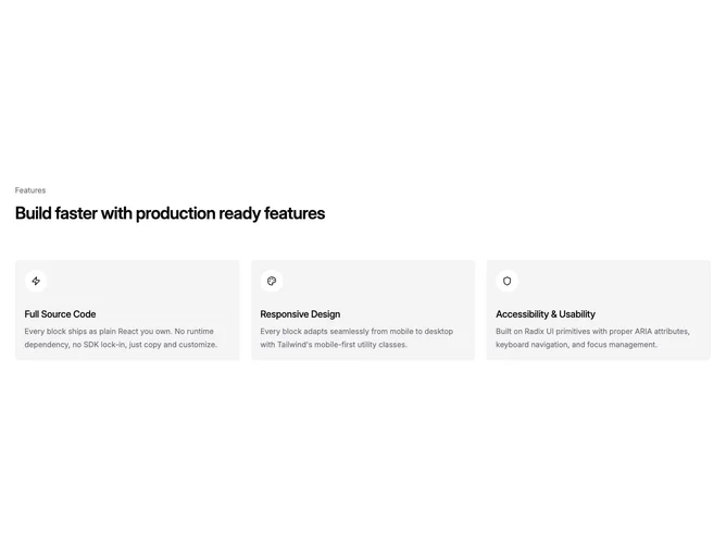
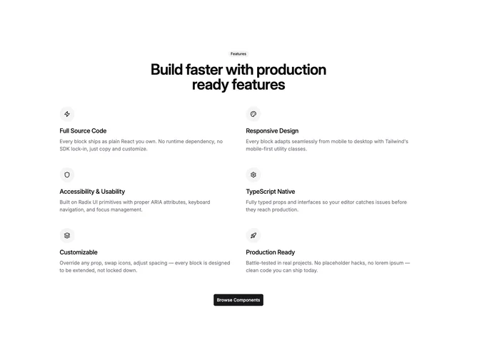
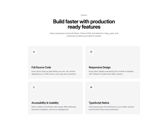
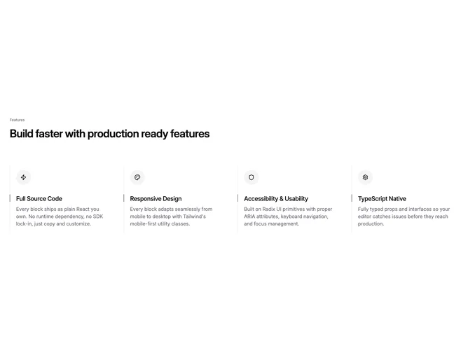
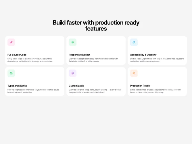
Shadcn Feature Icon List Blocks

Browse and download 43+ Shadcn UI Feature Icon List blocks. Built with React, Tailwind and shadcn/ui. These shadcn components are ready to download, copy and paste or install with the shadcn registry.

Shadcn Feature 349 - Centered Feature Cards

Centered Feature Cards

Shadcn Feature 350 - Centered Four Column Feature Grid

Centered Four Column Feature Grid

Shadcn Feature 351 - Left Aligned Four Column Features

Left Aligned Four Column Features

Shadcn Feature 352 - Left Aligned Two Column Feature Cards

Left Aligned Two Column Feature Cards

Shadcn Feature 353 - Centered Heading Four Column Accent Cards

Centered Heading Four Column Accent Cards

Shadcn Feature 354 - Grid Integrated Heading With Icon Cards

Grid Integrated Heading With Icon Cards

Shadcn Feature 355 - Centered Feature Link Cards

Centered Feature Link Cards

Shadcn Feature 356 - Left Aligned Three Column Accent Cards

Left Aligned Three Column Accent Cards

Shadcn Feature 357 - Centered Large Icon Feature Row

Centered Large Icon Feature Row

Shadcn Feature 358 - No Intro Three Column Bordered Cards

No Intro Three Column Bordered Cards

Shadcn Feature 359 - Centered Two Column Accent Feature Cards

Centered Two Column Accent Feature Cards

Shadcn Feature 360 - Left Aligned Divided Feature Grid

Left Aligned Divided Feature Grid

Shadcn Feature 361 - Centered Four Column Inline Icon Features

Centered Four Column Inline Icon Features

Shadcn Feature 362 - Split Layout With Three Column Feature Grid

Split Layout With Three Column Feature Grid

Shadcn Feature 363 - Centered Feature Cards With Button CTA

Centered Feature Cards With Button CTA

Shadcn Feature 364 - Minimal Four-Column Icon Grid

Minimal Four-Column Icon Grid

Shadcn Feature 365 - Minimal Three-Column Icon Grid

Minimal Three-Column Icon Grid

Shadcn Feature 366 - Minimal Inline Icon Grid

Minimal Inline Icon Grid

Shadcn Feature 367 - Minimal Centered Four-Column Grid

Minimal Centered Four-Column Grid

Shadcn Feature 368 - Minimal Centered Three-Column Grid

Minimal Centered Three-Column Grid

Shadcn Feature 369 - Minimal Naked Icon Grid

Minimal Naked Icon Grid

Shadcn Feature 277 - Four-column feature cards with read more

Four-column feature cards with read more

Shadcn Feature 276 - Feature grid with shared hover highlight

Feature grid with shared hover highlight

Shadcn Feature 210 - Icon-led feature links in a responsive grid

Icon-led feature links in a responsive grid

Shadcn Feature 194 - Icon feature cards with learn-more buttons

Icon feature cards with learn-more buttons

Shadcn Feature 170 - Icon values strip with text link

Icon values strip with text link

Shadcn Feature 159 - Four-up integration icons with trailing link

Four-up integration icons with trailing link

Shadcn Feature 128 - Centered icon grid with short blurbs

Centered icon grid with short blurbs

Shadcn Feature 135 - Sticky intro column beside stacked feature cards

Sticky intro column beside stacked feature cards

Shadcn Feature 76 - Bordered icon row with up to four columns

Bordered icon row with up to four columns

Shadcn Feature 68 - Icon grid framed below section intro

Icon grid framed below section intro

Shadcn Feature 67 - Split intro with six bordered icon cards

Split intro with six bordered icon cards

Shadcn Feature 43 - Icon reasons with centered call to action

Icon reasons with centered call to action

Shadcn Feature 42 - Values heading spanning a three-column grid

Values heading spanning a three-column grid

Shadcn Feature 35 - Large grid headline beside three arrow links

Large grid headline beside three arrow links

Shadcn Feature 26 - Six-up icon grid with section badge

Six-up icon grid with section badge

Shadcn Feature 18 - Icon-led feature cards up to six

Icon-led feature cards up to six

Shadcn Feature 16 - Three pillar cards with outlined icons

Three pillar cards with outlined icons

Shadcn Feature 17 - Six-up icon grid with centered intro

Six-up icon grid with centered intro

Shadcn Feature 15 - Centered intro with paired icon tiles

Centered intro with paired icon tiles

Shadcn Feature 10 - Icon feature columns with dashed borders

Icon feature columns with dashed borders

Shadcn Feature 278 - Full-height muted grid without subhead

Full-height muted grid without subhead

Shadcn Feature Icon List Blocks

A shadcn feature icon list block provides a specialized feature layout focused on the icon list pattern. It appears on landing pages, product pages, and marketing sites where feature content needs a distinct visual treatment.

Each block is a self-contained React component which you can copy/paste the code or install via the shadcn CLI. You own the code — customize the layout, content, and styling using Tailwind utility classes.