Feature 278 block design & features
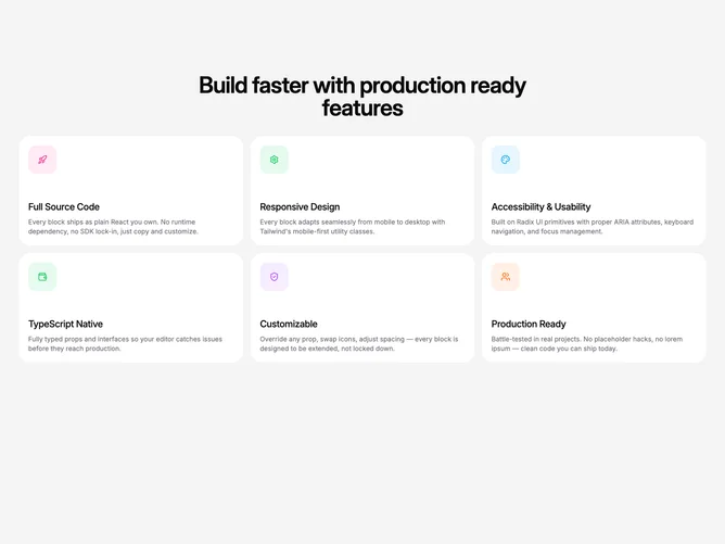
Feature278 is a full-height feature grid built with shadcn/ui on a muted canvas, centered around a single large heading with no secondary paragraph under it. Up to six cards sit in a responsive grid that peaks at three columns, each pairing an icon with a title and supporting sentence.
Rounded card frames and solid pastel fills on hover give each tile a distinct color identity while the surrounding field stays quiet. Type hierarchy is simple: one dominant section title, then smaller titles inside cards. Hover states drive almost all the visual drama, with quick transitions rather than looping animation.
The look is bold and colorful yet still template-friendly: strong grid rhythm, obvious hover affordance, and icon-led scanning. This is a moderate-complexity block because of the fixed palette rotation and motion, but content needs are straightforward titles and blurbs for six slots at most.
When the viewport narrows, the grid steps down to one or two columns so hover targets stay large enough for touch and pointer use.