Feature 349 block design & features
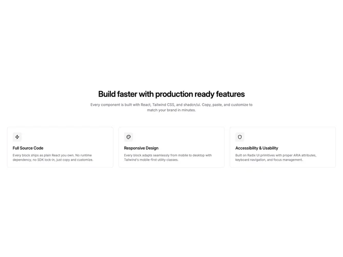
Feature349 is a straightforward shadcn/ui feature section built around a centered intro block and a three-column grid of bordered cards. Each card contains a square icon badge in a muted container, a title, and a short description. The heading and description sit above the grid in a constrained centered column.
The visual style is clean and restrained. Cards use a simple border with no background fill, giving them a lightweight feel against the page surface. The square icon badges use a subtle muted background with rounded corners. Spacing is generous between cards and between the intro and the grid.
This is one of the most common SaaS feature section patterns, kept deliberately simple. There are no hover effects, animations, or decorative elements. It reads as a standard, reliable Shadcn UI feature grid suitable for any product marketing page that needs to present three capabilities at a glance.