
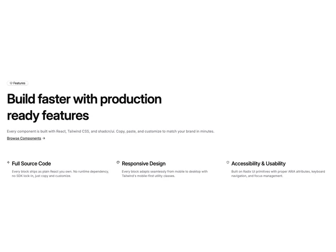

Feature 170 block design & features
Feature170 adapts the shared feature-icon-list defaults into a tighter marketing hero using shadcn/ui Badge styling with a Heart icon, very large semibold heading, optional description rendered in muted foreground, and a primary-styled inline link that shows an ArrowRight icon when button props include text and URL.
Below the intro, a grid advances from one column into two and then three, mapping at most three feature objects side by side. Each item aligns a passed-through icon element with a title in progressively larger type and a short muted explainer, using modest gaps rather than full cards.
The block reads as a calm values or pillar section with emphasis on typography and inline navigation instead of heavy surfaces. Because props default from the placeholder pack, most pages will replace label, heading, descriptive copy, the link target, and the first three icon rows, but the skeleton is simple.
Spacing tightens on small screens and opens with larger section padding on wide layouts, keeping the CTA text directly under the paragraph cluster.