Feature 361 block design & features
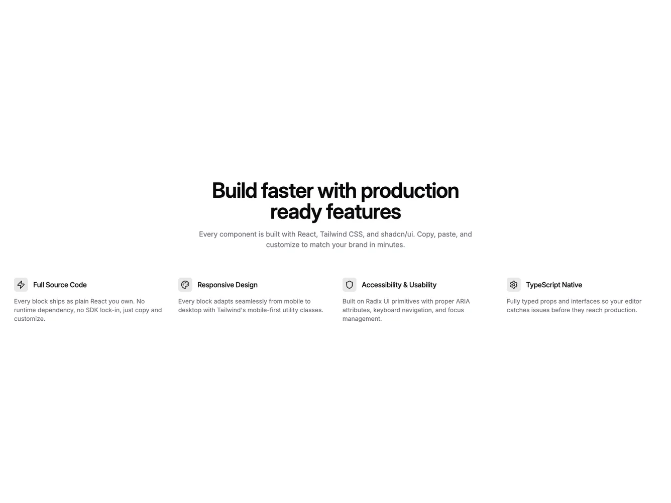
Feature361 is a shadcn/ui feature section with a centered intro and a four-column grid of features where each icon sits inline beside the title rather than stacked above it. Icons use a small tinted primary-color badge, creating a colored accent point next to each feature name. The description sits below the icon-title row.
The inline icon-title treatment compresses vertical space in each item, making the grid denser and more scannable than stacked icon layouts. The primary-tinted icon badges add a subtle brand color accent without overwhelming the muted text palette. Items have no card surface or border.
This is a compact Shadcn UI pattern for four-column layouts where the icon serves as a visual marker rather than a dominant element. The inline placement and tinted primary color differentiate it from the circle-badge and standalone-icon treatments common in other blocks.