
Feature 362 block design & features
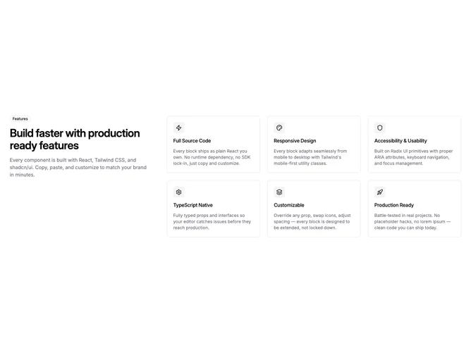
Feature362 is a shadcn/ui feature section with a split layout: a one-third-width left column containing a sticky badge, heading, and description, and a two-thirds-width right column with a three-column grid of six bordered icon cards. Each card has a small square icon badge, title, and description.
The sticky left column keeps the intro visible as users scroll through the feature grid on tall viewports. The three-column grid on the right provides dense coverage while the left column anchors the context. Cards use compact padding with muted square icon badges.
This fills the split-layout plus multi-column-grid gap. Previous split blocks in this subgroup (feature67) only go to two columns. The Shadcn UI three-by-two grid on the right side gives this block significantly more item density while the sticky intro maintains readability.