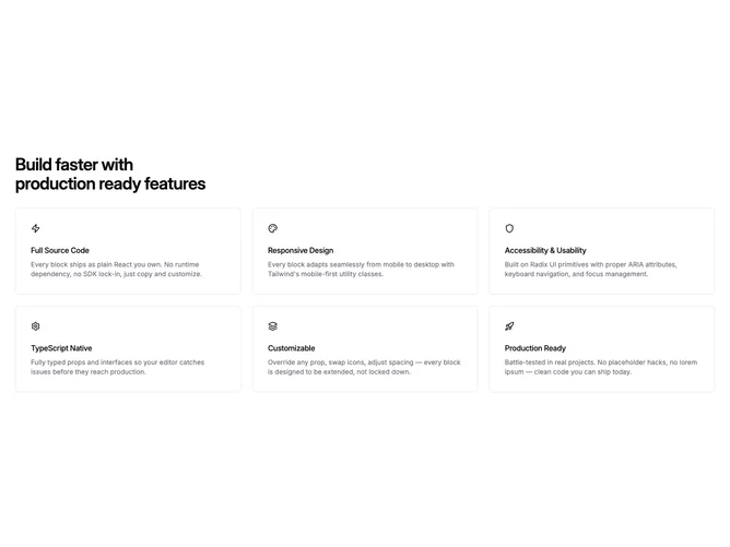
Feature 18 block design & features
Feature18 is an icon-centric feature catalog section built around Shadcn UI spacing primitives and bordered surface cards from your theme tokens. Content begins with a single strong heading anchored left, constrained to readable width relative to the overall container. Beneath it, rows of cards assemble into one column by default then widen into two columns and finally three when space permits, trimming the roster to six items at most. Inside each tile the icon anchors the top of the narrative block, followed by medium-weight title copy and tighter muted explanatory text.
A repeating wave motif masks a subtle tinted wash across the full section backdrop, capped by an elliptical radial fade that restores focus toward the foreground cards. Tiles themselves sit on neutral background panels with restrained corner rounding and consistent vertical rhythm between headline, body, and link.
The styling sits close to a neutral marketing baseline: restrained borders, approachable type scale, and optional chevron-accented link rows that keep rows scannable. It is a moderate-complexity block because it expects real iconography and meaningful feature blurbs for every cell, but the layout rules are straightforward once copy exists.
On small screens the heading leads, then each card reads as a full-width stack; link rows stay bottom-aligned within their card so columns still align visually when some items omit links.