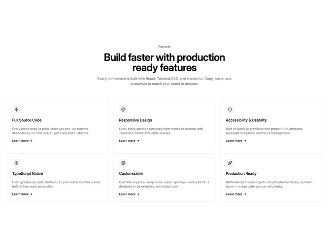
Feature 355 block design & features
Feature355 is a shadcn/ui feature section with a centered intro block and a three-column grid of six bordered link cards. Each card is a full anchor element with a circular icon badge, title, description, and a "Learn more" link with an arrow icon. Cards transition to a muted accent background on hover.
The interactive treatment is CSS-only with no JavaScript or animation libraries. The hover state swaps the card background to accent while the icon badge inverts from accent to background, creating a clean toggle effect. The arrow icon shifts slightly on hover for subtle motion feedback.
This is a practical Shadcn UI pattern for feature sections where each item leads to a dedicated page or detail view. The per-item CTA and hover affordance make it immediately clear that cards are interactive, distinguishing it from static feature grids in the same subgroup.