Feature 15 block design & features
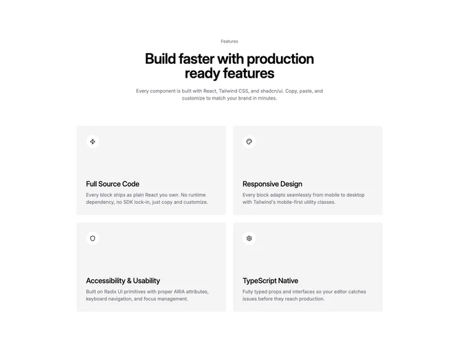
Feature15 opens with restrained hero copy built with Shadcn UI text styles: optional muted eyebrow sentence, heavyweight balanced heading, explanatory paragraph narrowed for comfortable line length before the grid engages. Supporting grid renders at most four feature tiles within two columns on wider layouts while each tile elevates circular icon medallions above title and explanatory copy inside rounded accent panels sized to similar minimum heights.
Visual treatment relies on tinted accent surfaces contrasting circular white icon wells, soft rounded tile corners with generous vertical padding pulling plenty of whitespace, typography stepping from semibold headings to subdued body descriptors. Decorative moves stay minimal relying on chroma shifts instead of ornate borders; animations default static absent external motion libraries.
Interpretation skews approachable product marketing with basic building blocks close to starter kit styling yet still presentation ready when icons and copy are polished. Complexity is low structurally but content quality matters because icons need meaningful parity and copy must stay parallel in length. Layout is content-driven with props rather than hardcoded fixtures.
Handheld layout stacks tiles single column maintaining comfortable tap targets and maintaining minimum tile height feel.