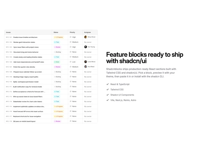
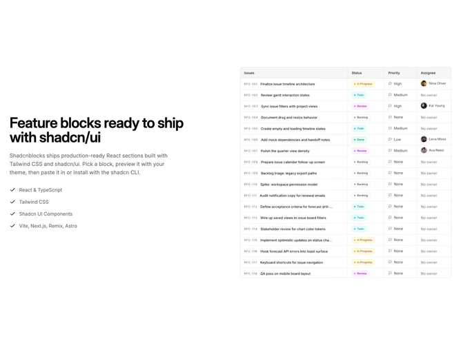
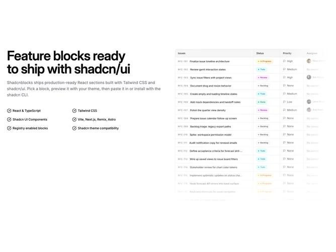
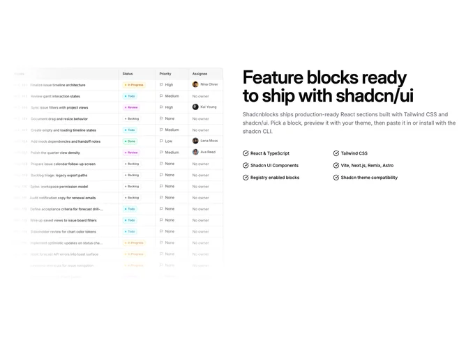
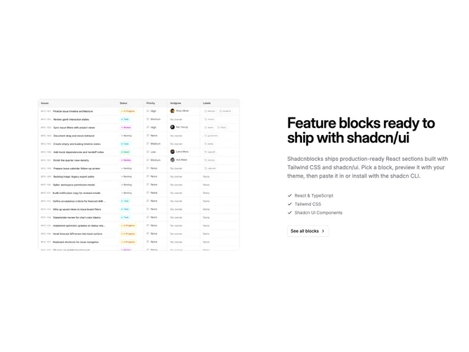
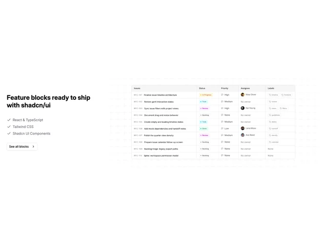
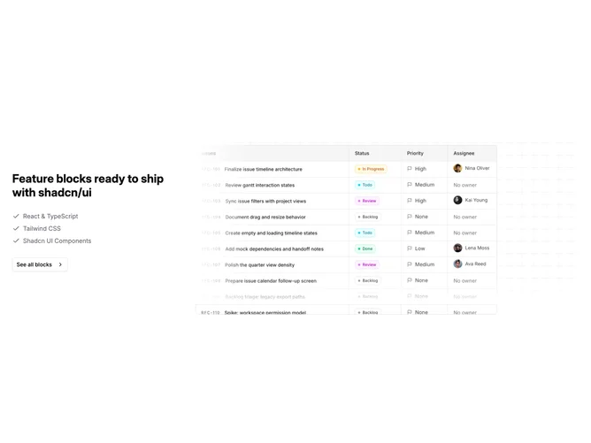
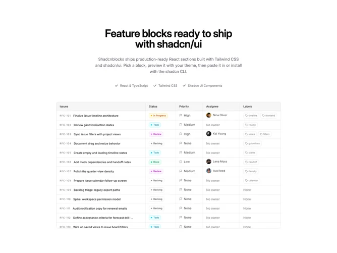
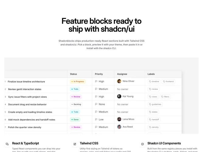
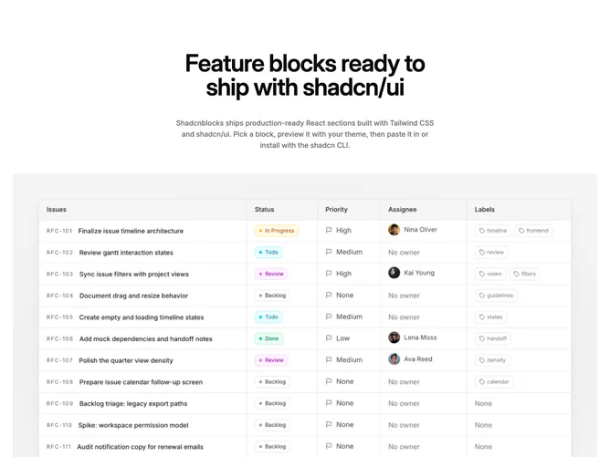
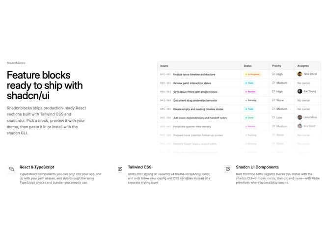
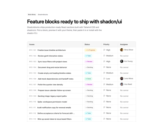
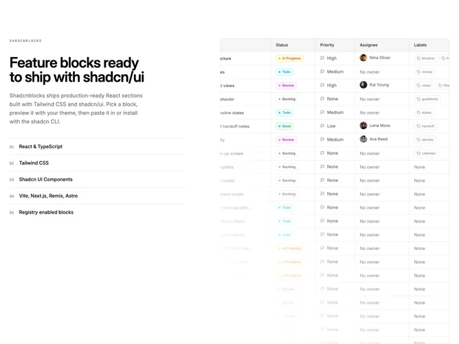
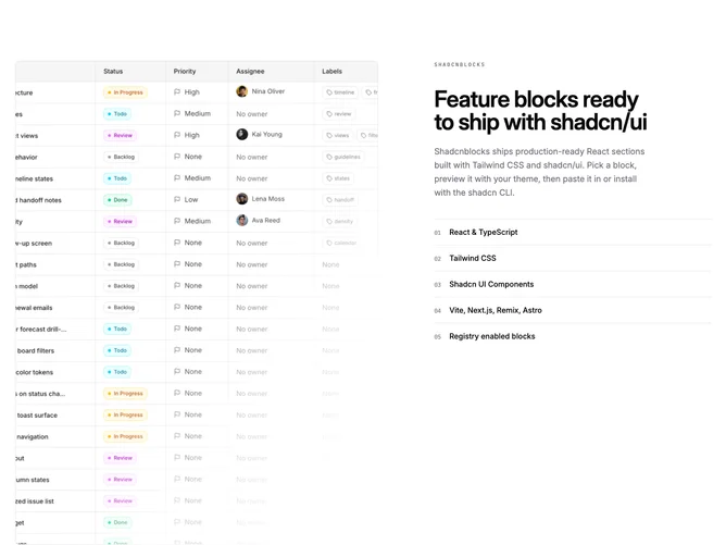
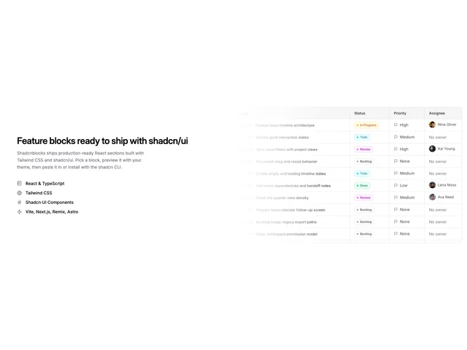
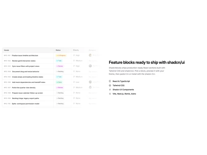
Shadcn Feature Single Focus Blocks

Browse and download 28+ Shadcn UI Feature Single Focus blocks. Built with React, Tailwind and shadcn/ui. These shadcn components are ready to download, copy and paste or install with the shadcn registry.

Shadcn Feature 61 - Image-right split with stacked body copy

Image-right split with stacked body copy

Shadcn Feature 60 - Image-left split with stacked body copy

Image-left split with stacked body copy

Shadcn Feature 1 - Two-column feature with square image and button

Two-column feature with square image and button

Shadcn Feature 2 - Split feature row with image and dual actions

Split feature row with image and dual actions

Shadcn Feature 7 - Checklist beside square bordered image

Checklist beside square bordered image

Shadcn Feature 6 - Split feature with checklist and square image

Split feature with checklist and square image

Shadcn Feature 227 - Split copy with checklist and photo

Split copy with checklist and photo

Shadcn Feature 344 - Split Feature With Left Image

Split Feature With Left Image

Shadcn Feature 345 - Split Feature With Right Image

Split Feature With Right Image

Shadcn Feature 11 - Split image with dotted list and outline button

Split image with dotted list and outline button

Shadcn Feature 139 - Bordered spotlight card with four detail columns

Bordered spotlight card with four detail columns

Shadcn Feature 372 - Checklist Feature With Right Pattern Media

Checklist Feature With Right Pattern Media

Shadcn Feature 346 - Checklist Feature With Left Pattern Media

Checklist Feature With Left Pattern Media

Shadcn Feature 124 - Checklist and CTA beside patterned image column

Checklist and CTA beside patterned image column

Shadcn Feature 125 - Feature checklist beside masked illustration panel

Feature checklist beside masked illustration panel

Shadcn Feature 347 - Checklist Feature With Offset Left Media

Checklist Feature With Offset Left Media

Shadcn Feature 373 - Split Feature Bleeding Image Leading Left

Split Feature Bleeding Image Leading Left

Shadcn Feature 375 - Split feature with contained leading image

Split feature with contained leading image

Shadcn Feature 33 - Hero imagery above three linked feature columns

Hero imagery above three linked feature columns

Shadcn Feature 376 - Centered feature overview with icon grid

Centered feature overview with icon grid

Shadcn Feature 58 - Editorial feature with framed media and icon checklist

Editorial feature with framed media and icon checklist

Shadcn Feature 374 - Editorial split feature with side rail

Editorial split feature with side rail

Shadcn Feature 377 - Editorial split with leading portrait image

Editorial split with leading portrait image

Shadcn Feature 38 - Minimal split feature with masked image

Minimal split feature with masked image

Shadcn Feature 378 - Minimal split with leading masked image

Minimal split with leading masked image

Shadcn Feature Single Focus Blocks

A shadcn feature single focus block focuses on a single item or plan rather than a comparison layout. This pattern works well for products with one price point, simple tools, or flat-rate offerings.

Each block is a self-contained React component which you can copy/paste the code or install via the shadcn CLI. You own the code — customize the layout, content, and styling using Tailwind utility classes.