Feature 376 block design & features
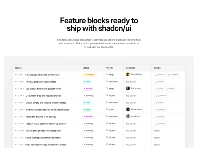
Feature376 opens with centered headline and body copy built with Shadcn UI patterns, then drops into a muted media shell that holds a widescreen product or marketing image. Below that, three feature entries appear in a row, each pairing a rounded icon tile with a title, optional supporting line, and optional text link.
The hero image uses a bordered card treatment with gentle radial backlighting and subdued shadow so the photo feels slightly elevated without stealing the entire page palette. Icons use small filled squares or circles so the trio scans quickly as bullets with more polish than plain text alone.
This block sits between a simple icon trio and a heavy split-layout feature: one strong panoramic visual, then three supporting claims. It works well for launch pages or overview sections where you want a single screenshot moment followed by succinct value props. You need one landscape-ready image plus three coherent subpoints to avoid uneven rows.
The three-up grid steps down from three columns to two and then one on smaller breakpoints while keeping spacing even.