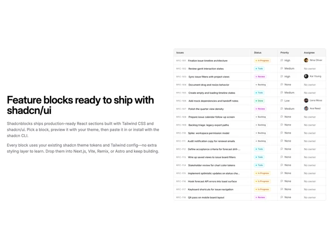
Feature 61 block design & features
Feature61 pairs the same single-focus content model as its sibling block but flips the large-screen row so the visual and text halves swap sides, using Shadcn UI text styles and a responsive flex row. You still get a bordered square image, bold heading, first paragraph, and optional follow-up paragraph in muted tone.
Spacing matches the image-left variant: wide gutters, larger title sizes on medium breakpoints, and vertically centered text relative to the image column when height allows. The look remains understated with borders instead of heavy framing.
Functionally it answers layout balance when a page already shows imagery on the left elsewhere; alternating splits reduces sameness without new components. Content requirements mirror the twin block: heading, copy, optional second paragraph, one square asset.
On compact widths the column order follows the DOM; verify your desired mobile story if the image should lead versus follow compared with neighboring sections.