Feature 11 block design & features
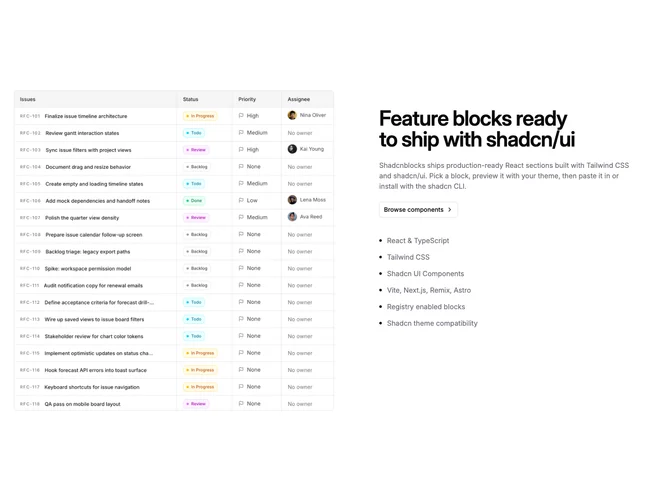
Feature11 is a split layout built with Shadcn UI that places a square bordered image on one side and a text stack on the other inside generous vertical padding. Default placeholder content talks about shipping feature blocks with shadcn/ui: the heading leads, a muted paragraph follows, then an outline button styled as a link target that includes a trailing chevron when secondary button props are set. Below that sits a simple role=list stack where each row pairs a tiny circular primary marker with muted sentence-length titles (the component caps visible rows at six).
Spacing opens up on large screens with optional horizontal padding inside the text column while the image keeps a fixed half-width proportion at medium breakpoints and stacks above copy when columns collapse.
This is a straightforward single-story block: one visual anchor, one narrative, and a scannable list without icons beyond the dot bullets. Complexity stays low and relies on swapping photography plus list strings rather than nested components.
The flex direction switches from column to row so imagery stays prominent on mobile without shrinking readability.