Feature 124 block design & features
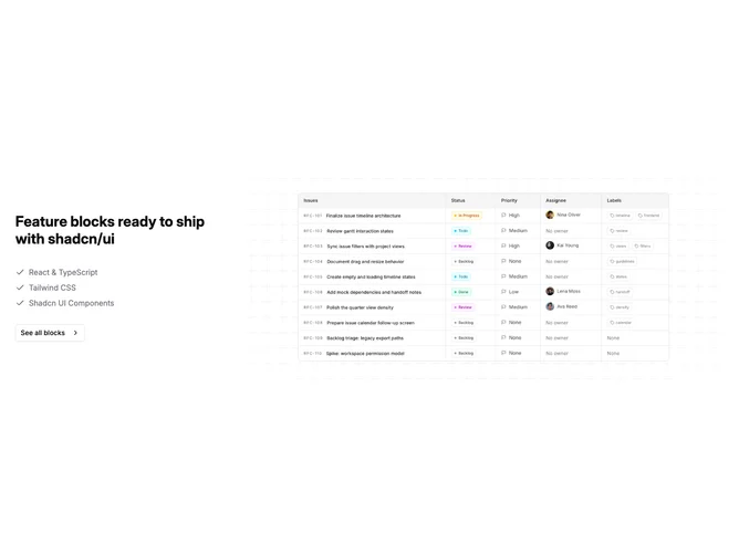
Feature124 pairs text with visuals in a two-column section built with Shadcn UI. The text column includes a label, headline, paragraph, a short checklist with check icons, and a solid call-to-action button. The opposite column shows a rounded image treatment sitting on layered background shapes, gradients, and a subtle geometric motif behind the frame.
Muted neutrals with restrained accent on the button keep claims readable. The image side feels richer because of overlapping fills and soft color ramps while the text side stays mostly flat. Rounded image corners and generous padding make the scan path obvious without tight grids.
Balanced and professional with polish typical of marketing sites. The checklist pattern is familiar; the patterned backdrop behind the image is the main differentiation from a plain split row. Complexity is moderate because copy stays straightforward while the visual half carries layered decoration.
The columns typically stack on small screens with text first so claims and the checklist stay primary.