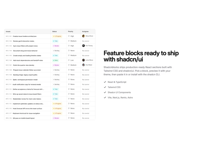
Feature 7 block design & features
Feature7 is built with shadcn/ui typography patterns and contrasts a photographic or illustrative tile with textual proof beside it. Orders swap so stacked small screens encounter copy first yet large breakpoints can place imagery leading or trailing depending on the grid order baked into the markup. Beneath headline and explanatory paragraph sits a capped list whose entries render as succinct benefit lines each preceded by check marks.
Bordered imagery with squared aspect reinforces an almost swatch-panel presentation; body copy adopts muted foreground colors while bullets stay evenly spaced stacks. Hierarchy leans headline-first with generous margins before enumerated lines. Hover states lean on anchors if you wrap links around imagery rather than flashy transforms.
Straightforward editorial split resembling common product reassurance sections. Complexity is intentionally low: swap default strings, image props, up to four bullet titles, nothing more ornate. Distinguished mostly by restraint and readability rather than novel layout invention.
Responsive ordering keeps both columns readable with comfortable vertical gaps once they collapse sequentially.