Feature 139 block design & features
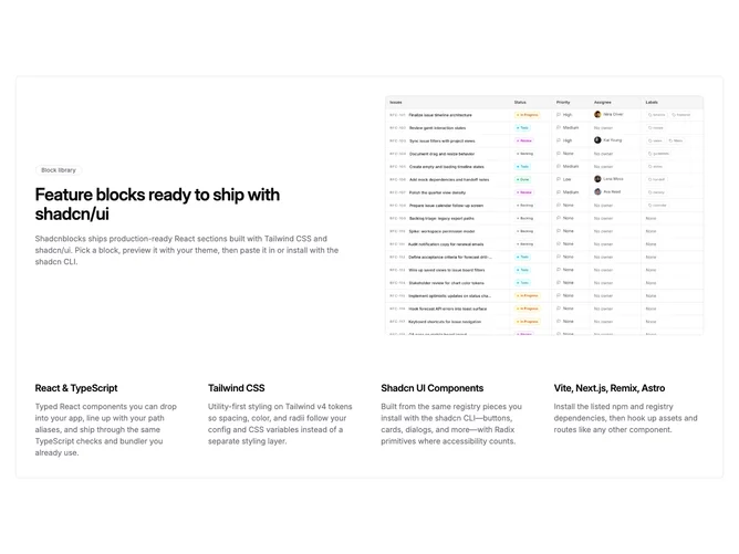
Feature139 wraps an entire story inside one elevated surface built with Shadcn UI. The upper half is a two-column split on medium screens: text on one side with optional outline badge, large heading, and muted description, and a bordered landscape image on the other. Generous internal padding and a card background make the whole block feel like a single publishable module rather than a loose stack.
Below, a wide grid steps from one column on phones to two on small tablets and four across on desktop. Each cell is a heading with a supporting paragraph in smaller muted type; the rhythm is editorial and stat-like even though the UI does not print literal numerals.
Visually the block is tidy and slightly premium: one outer border, rounded outer corners, restrained badge styling, and photography framed to match the container width. The aesthetic is closer to polished SaaS marketing than experimental layout.
Complexity is moderate because you need a coherent hero message, a strong supporting visual, and up to four succinct supporting points to avoid uneven columns. Mobile keeps the narrative linear: text and image first, then the detail grid beneath.