Feature 344 block design & features
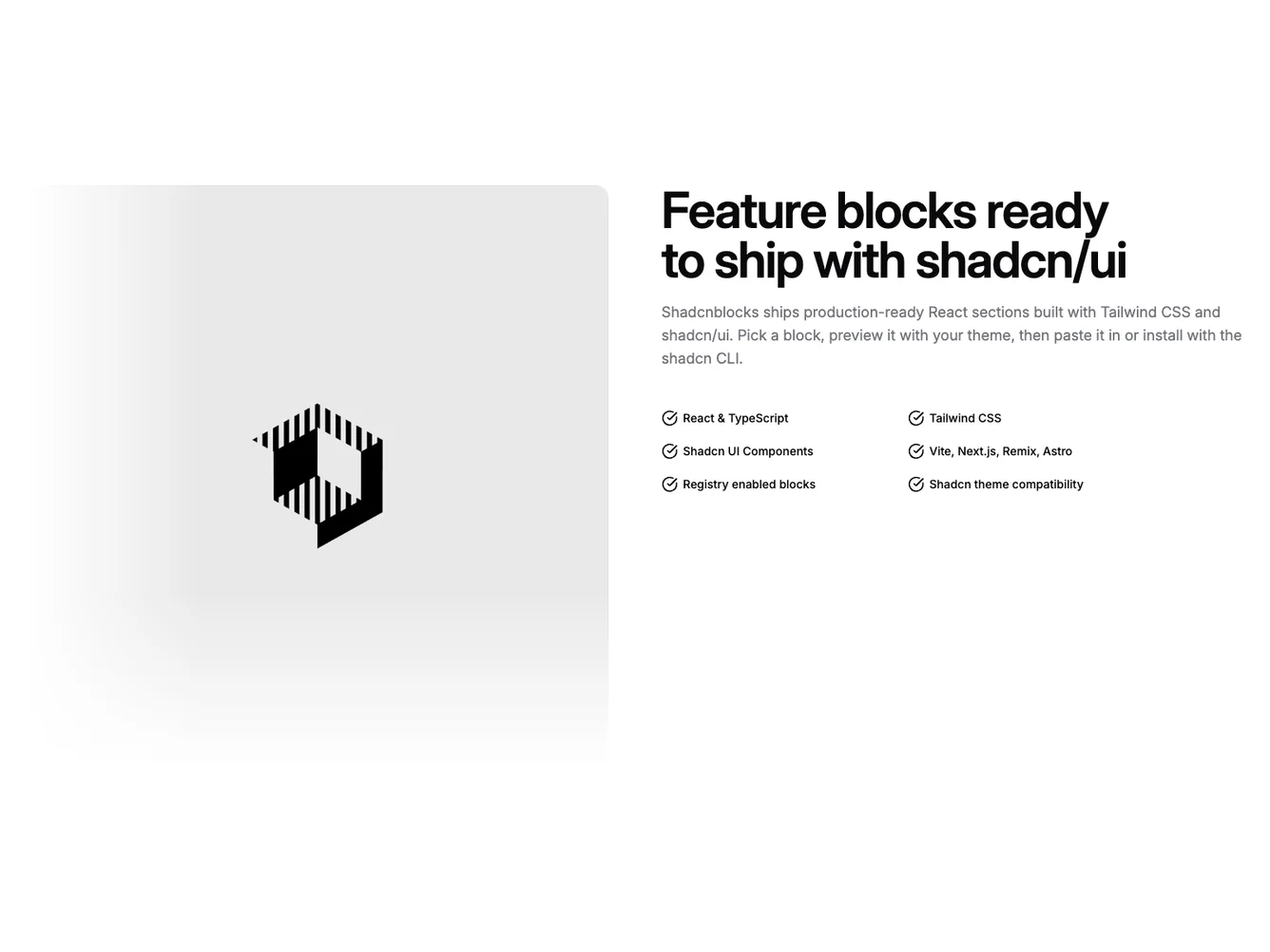
This Shadcn UI block uses a responsive two-column grid inside a standard section with vertical padding. On large screens the media column sits on the left and the text stack on the right; on small screens the copy and checklist appear first and the image follows. The visual is a single bordered photograph with two absolute gradient scrims that feather into the page background along the top and the inward-facing edge.
The look is calm and product-marketing oriented: a very large balanced heading, muted body copy, and a compact checklist using circular check icons in a two-column list on wider breakpoints. Borders and radii follow the default card language, and gradients rely on theme background tokens rather than flat overlays.
Overall this is a straightforward single-focus feature pattern with a clear left-right split on desktop. It mirrors common SaaS marketing rhythm without extra badges or buttons, so the checklist carries most of the detail.
On narrow viewports the section stacks in reading order, keeping the narrative before the image so the layout stays scannable before users reach the visual.