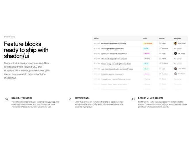

Feature 89 block design & features
Feature89 is a single-focus feature block built with Shadcn UI, pairing a narrow text column with a large product image on wide screens. A small mono label sits above the headline and description. Below the header row, three feature cells each show a rounded icon tile, a title, and an optional supporting line. A faint dot-grid halo appears behind the section on large viewports only.
Typography leans editorial: medium-weight headlines, relaxed body copy, and muted secondary text. The image uses a top-weighted crop with a bottom gradient fade into the page background so the photo blends into the layout. Icon tiles sit on white surfaces with a light shadow, giving the lower grid a card-like rhythm against open whitespace.
The overall feel is modern SaaS marketing with a restrained palette and one strong visual anchor. It is more elaborate than a text-only feature strip because of the desktop image and decorative grid, but still straightforward to populate with three benefit blurbs and one screenshot. Content-driven rather than animation-driven.
The product image hides below the large breakpoint; mobile and tablet users see the label, headline, description, and three-column feature grid only. The dot pattern and side image are desktop embellishments.