
Feature 372 block design & features
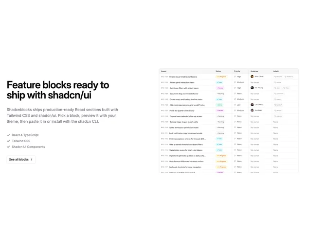
This Shadcn UI block mirrors the checklist single-focus pattern with copy first and a decorative media well second. On medium screens and up the row stays in source order so the text column sits on the left and the framed four-by-three image sits on the right. The text side uses a bold heading, paragraph, a vertical checklist with check icons in the primary color, and an outline button with a trailing chevron.
The media side is a fixed-height panel with a repeating cross pattern masked in primary-tinted color, a soft radial gradient toward the background, and linear scrims that feather into the page from the outer edges. The photo is centered at a controlled width with rounded corners and border.
The block reads like focused product marketing: strong heading weight, muted list lines, and a contained pattern behind the asset. On small screens the layout stacks with copy before the media column so the story leads.