Feature 60 block design & features
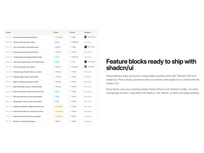
Feature60 arranges shared single-focus content into a horizontal split on large screens built with shadcn/ui. The first column holds a square image with rounded corners and border, while the second column vertically centers a large heading and one primary body paragraph, with an optional extra paragraph spaced beneath when provided.
Muted text, semibold title scaling up on tablet, and generous horizontal gap between columns keep the layout calm and legible. The image reads as a discrete tile rather than a bleed, which suits product screenshots or interface captures.
This is a simple split block with low visual novelty but high utility for classic “story plus screenshot” pages. Complexity is mostly content: you choose whether the second paragraph appears for longer explanations.
The flex row stacks on small screens with standard mobile ordering from the markup, so the image block appears before the text column unless you adapt the source order in code.