

Feature 58 block design & features
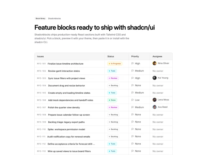
Feature58 is a single-column feature section built with Shadcn UI badge and button. Content reads top to bottom: optional badge and small label row, a large heading with room for a second muted line under it, one supporting paragraph, then a single large primary link-style action with a trailing arrow. A wide framed media band sits between story copy and proof points; the frame uses border, corner radius, light ring, and muted panel behind a four-by-three crop aligned to the top edge of the image.
The lower region is a sparse grid of up to four items, two per row on wider viewports. Each row pairs a small outline icon in the primary color with a bold title and muted description. There are no cards or numbers, so the checklist feels editorial rather than a pricing matrix.
Overall tone is restrained and documentation-adjacent: plenty of whitespace, semibold headlines, muted body, hairline borders. It suits a narrative where one screenshot carries the story and short blurbs nail supporting claims without extra chrome.
On narrow screens the stack stays one column, the media band remains edge-to-edge within the container, and the two-column checklist collapses to a single column with comfortable vertical rhythm.