Feature 2 block design & features
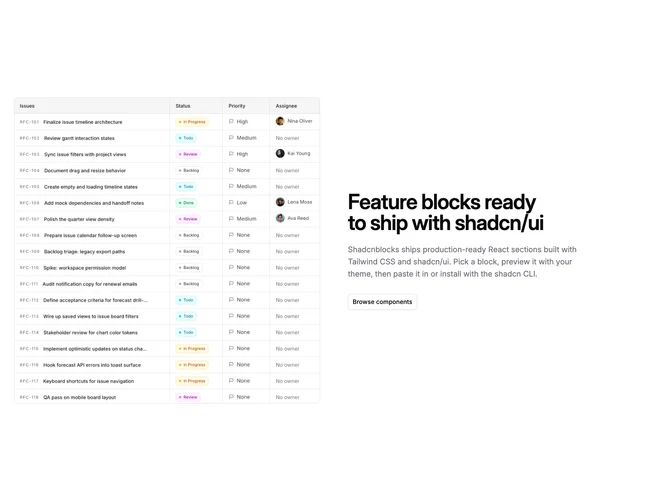
Feature2 is a straightforward split feature row built with Shadcn UI. One side carries a single image while the opposite side holds a section title, explanatory copy, and two buttons arranged as primary and secondary actions. The layout reads as a classic product explainer: prove the claim with a visual, then offer the next steps in text.
Spacing is balanced so neither column feels squeezed; text aligns from a consistent anchor on large screens and recenters when the grid stacks. Buttons sit together near the bottom of the text column so the eye finishes on actions after the paragraph. The image typically keeps rounded corners or a simple frame so it does not compete with the typographic column.
This is a simple, standard pattern close to starter marketing layouts, with little ornament beyond grid alignment and default component styling. It stands out only through the asset and copy you supply. Expect to provide one strong image, a headline, a short body, and two labels with destinations.
Below the largest breakpoints the columns stack, usually with copy first or image first depending on implementation order, and buttons stretch or wrap according to width.