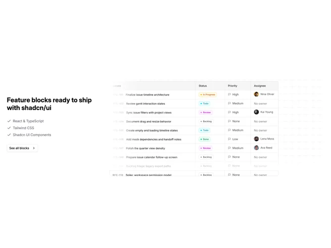
Feature 125 block design & features
Feature125 presents product talking points beside illustration or photography in a layout built with shadcn/ui. One column carries eyebrow text, headline, description, several checked lines, and a CTA. The other column centers a large asset with decorative masking and gradient washes that frame rather than compete with the subject.
Soft contrast with gradual color transitions behind the image and crisp type on the text side. Icon-style checks anchor each line in the list. The visual column carries most of the atmospheric color while typography stays high contrast.
Contemporary SaaS marketing aesthetic that reads credible and slightly glossy rather than wireframe minimal. Distinctive mainly through the masked hero treatment and stacked checklist rather than novel typography. Content expectations are higher because weak lines or a generic image show quickly; decoration is image-driven more than code-heavy.
Responsive stacking keeps copy above the visual so scanning stays linear on phones.