Feature 347 block design & features
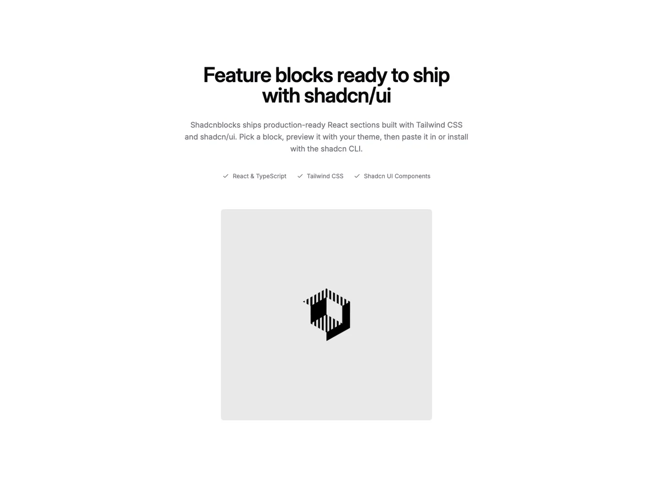
This Shadcn UI block uses the same headline, checklist, and CTA structure as similar split features, but the media column uses lighter primary tinting on the masked pattern, stronger radial falloff, and tighter linear vignettes along the inward edges. From the medium breakpoint upward the flex row reverses so the image block leads on the left and the copy sits on the right.
The image sits toward the bottom-inside corner of its frame with asymmetric padding, which reads as a deliberate card float inside the pattern field rather than a centered thumbnail.
Overall the look is a bit moodier than a flat split: the scrims pull attention toward the center image while the text side stays crisp and high-contrast.
Narrow viewports stack text first and the media second so users see messaging before the decorative frame.