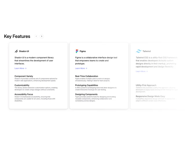
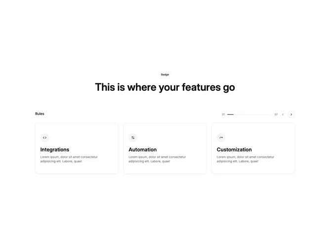
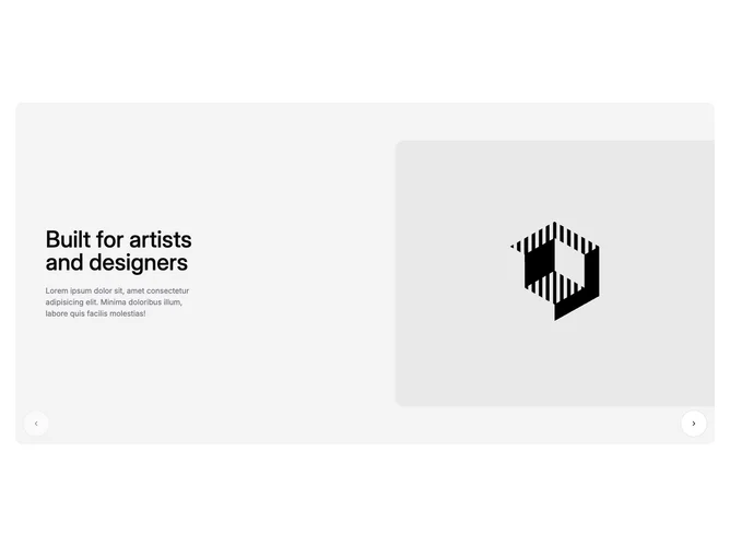
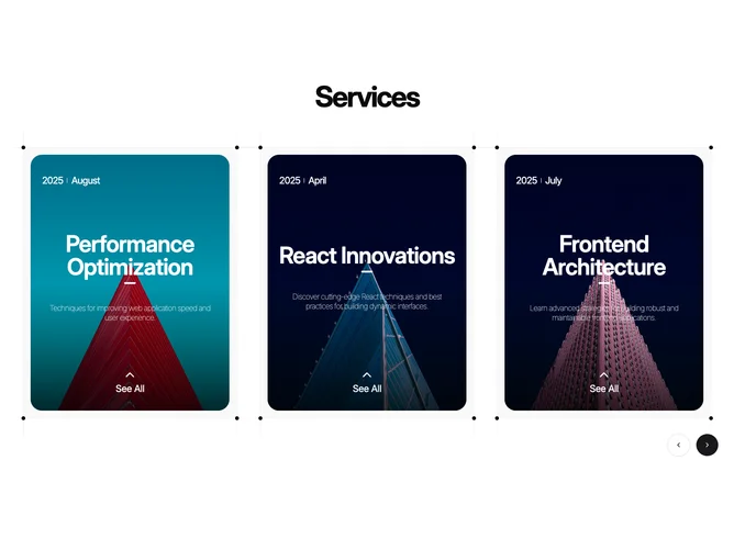
Shadcn Feature Carousel Blocks

Browse and download 16+ Shadcn UI Feature Carousel blocks. Built with React, Tailwind and shadcn/ui. These shadcn components are ready to download, copy and paste or install with the shadcn registry.

Shadcn Feature 114 - Split feature section with vertical carousels

Split feature section with vertical carousels

Shadcn Feature 70 - Carousel on the left with synced accordions

Carousel on the left with synced accordions

Shadcn Feature 224 - Carousel of photo cards with dual icons

Carousel of photo cards with dual icons

Shadcn Feature 244 - Feature carousel with dotted card frames

Feature carousel with dotted card frames

Shadcn Feature 215 - Centered headline carousel with aspect-ratio video cards

Centered headline carousel with aspect-ratio video cards

Shadcn Feature 153 - Integration carousel with detail lines

Integration carousel with detail lines

Shadcn Feature 12 - Feature carousel with progress rail

Feature carousel with progress rail

Shadcn Feature 140 - Full-bleed carousel of text-and-image slides

Full-bleed carousel of text-and-image slides

Shadcn Feature 240 - Services carousel with image hover reveal

Services carousel with image hover reveal

Shadcn Feature 69 - Carousel on the right with synced accordions

Carousel on the right with synced accordions

Shadcn Feature 209 - Split gallery with thumbnails and cross-fade preview

Split gallery with thumbnails and cross-fade preview

Shadcn Feature 57 - Feature list synced to a carousel

Feature list synced to a carousel

Shadcn Feature 242 - Testimonial carousel with slide controls

Testimonial carousel with slide controls

Shadcn Feature 323 - Vertical feature stack with expand-on-select cards and controls

Vertical feature stack with expand-on-select cards and controls

Shadcn Feature 214 - AI headline with video-on-hover carousel

AI headline with video-on-hover carousel

Shadcn Feature 370 - Wide feature carousel with tabs

Wide feature carousel with tabs

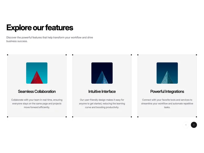
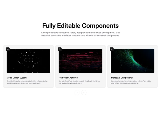
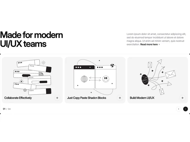
A shadcn feature carousel block presents feature content in a swipeable carousel or slider format. This layout is effective for showcasing multiple items in limited space while keeping the page compact.

Each block is a self-contained React component which you can copy/paste the code or install via the shadcn CLI. You own the code — customize the layout, content, and styling using Tailwind utility classes.