Feature 57 block design & features
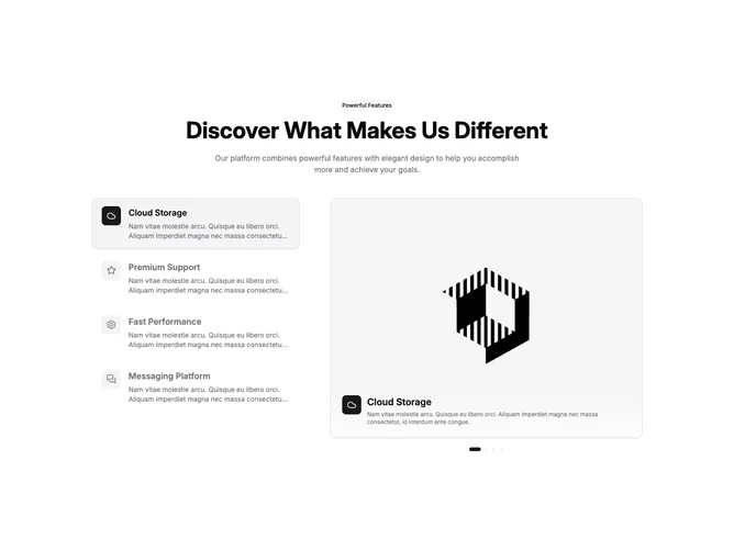
Feature57 is a split layout built with shadcn/ui badge and carousel pieces. Centered intro at the top carries an outline badge, a large title, and a short muted description. Below, a narrow column holds clickable feature rows with outline icons in small rounded squares, titles, and clipped descriptions. The wider column shows a looping carousel in a rounded, bordered frame with portrait-leaning aspect, a gradient scrim at the bottom with repeated icon and text, and pill-shaped dot controls under the frame.
Palette-wise, selected rows pick up accent background and a thin border while idle rows stay transparent until hover. The carousel area uses border, light shadow, and a bottom fade so the slide reads like a product still. Transitions are smooth on selection and slide change, giving a polished product-tour feeling.
This block is relatively elaborate because list and carousel stay in sync through client state. It feels current and interactive without heavy illustration. Uniqueness comes from coupling a vertical selector to a large visual rather than using tabs or static pairs.
Stacking on small screens puts the carousel group above the list so imagery leads; the list becomes a vertical chooser underneath. Dot controls remain for direct slide jumps.