Feature 244 block design & features
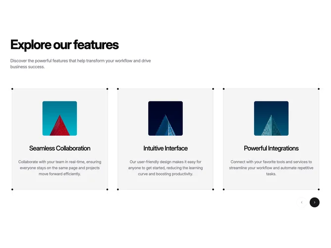
Feature244 is a product-feature carousel built with Shadcn UI cards and carousel primitives. A heading and description set context; each slide is a media-forward card with an image or screenshot area, a short title, and supporting text. Prev and next affordances let visitors move through more highlights than you would place in a single static grid.
The dotted frame around each card is the main decorative motif: it reads as a sketch or wireframe border and separates the slide from the page background without heavy shadows. Alignment favors a clean start-aligned stack of text beside or under the image, depending on the slide template, and motion stays tied to carousel transitions rather than busy per-element animations.
This is a balanced marketing pattern for teams with several parallel features and strong visuals. Complexity is moderate and mostly content-driven: you need credible images or UI captures per slide or the carousel will feel repetitive.
On narrow screens the carousel keeps one card in view at a time and preserves arrow controls so the section does not rely on sideways dragging alone.