Feature 215 block design & features
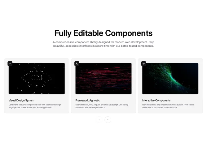
This block mirrors the hover-video carousel idea but wraps each clip in Shadcn UI aspect-ratio framing so previews stay consistent, pairs it with card primitives, and leads with a centered sans headline over muted supporting copy about an editable component library. Slides remain full-card links with icon chips, titles, and shorter descriptions than the sibling block, and carousel controls align center-bottom.
Muted backgrounds and rounded video frames keep the focus on motion inside each tile. Hover still plays video while leaving resets playback. Breakpoints show one, two, or three cards depending on width, which makes each item larger on phones than in denser carousels.
Stylistically it is straightforward product marketing with an emphasis on motion thumbnails. It is slightly less ornate than a serif-led version because headings use a sans condensed treatment. Expect similar production needs: short muted clips, icons, and crisp copy per slide. The placeholder text highlights accessibility and TypeScript themes, so you will likely replace the narrative for your own product.
Mobile behavior matches the hover limitation noted for touch devices: clips play only when hover or focus patterns are available unless you extend the interaction model.