Feature 240 block design & features
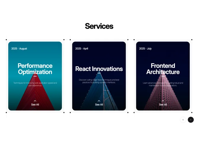
Feature240 presents a bold centered Services heading over a full-width Shadcn UI carousel with previous and next controls. Each slide is a tall framed card inside a dotted outline wrapper: a photo fills a rounded rectangle with a bottom gradient scrim, while overlay text carries year and month, large title, supporting description, and a chevron-driven See All stack at the bottom. Hovering a slide slightly deepens the muted shell behind the image and scales the photo for emphasis.
Dark scrims and light-on-dark overlay type create strong contrast on the photography. Dotted rules and corner-like framing give the carousel a poster grid character. Multiple items peek at once on medium and large breakpoints because basis classes show halves then thirds, encouraging horizontal browsing.
Editorial services or talk-track presentation rather than product comparison tables. Moderate complexity: carousel wiring, repeated content model with dated entries, and layered absolute positioning inside each slide. You need cohesive photography and succinct titles because the carousel loop moves quickly visually.
Breakpoints change how many cards are visible; controls remain accessible alongside the dotted frame that wraps the track.