Shadcn UI Feature Block
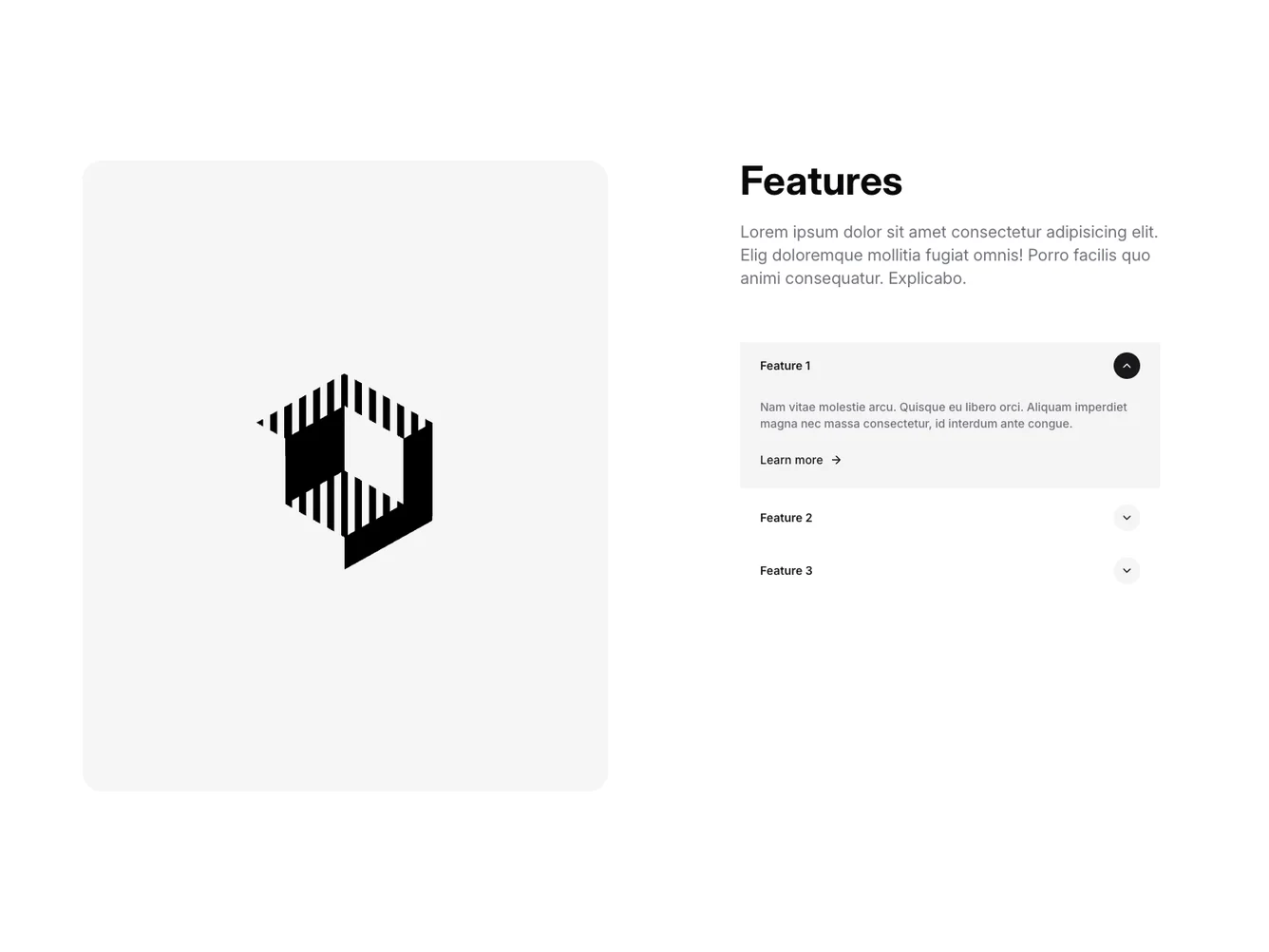
The Feature70 component presents an interactive display of features using a carousel and detailed descriptions in a list layout. This shadcn component allows users to explore various features with smooth transitions and visually engaging elements. The carousel on the left showcases feature images, while the right side provides detailed descriptions of each feature, offering a cohesive and informative user experience.
This shadcn block is designed with a focus on usability and dynamic interaction. It uses a carousel to display images associated with different features prominently. Parallel to this visual depiction, users can view feature titles and descriptions laid out in an easily navigable list. The component employs interactive elements such as hover effects and toggle buttons, enabling users to reveal more information about each feature by clicking on the corresponding list item. Through these design choices, Feature70 achieves a modern look that keeps users engaged and informed.
Dependencies
| Package | Type |
|---|---|
| lucide-react | NPM |
| react | NPM |
carousel @shadcn | Registry |
