Feature 69 block design & features
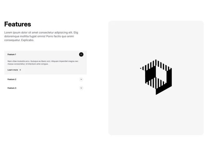
Feature69 is built with Shadcn UI carousel primitives and pairs a vertical image rail with a narrative list. The carousel sits in a rounded, aspect-tall frame while the opposite column carries a section title, intro copy, and click targets that open per-item descriptions and an arrow-styled follow-up link. Selection state on the list drives which slide is active and vice versa when the carousel moves, so visual and textual detail stay aligned.
Rounded shell, generous spacing between intro and list, circular affordance buttons that flip chevrons on open state, and muted paragraph tone create a restrained walkthrough vibe. Typography pairs a bold headline with smaller semibold triggers and subdued supporting lines. Hover highlights rely on swapping fill colors on circular controls tied to accents.
Higher interaction complexity than static grids because it couples expandable copy with synchronized imagery. Fits narrative feature tours where each item deserves a photographic anchor. Requires paired assets (one image plus title, teaser, expandable body, outbound link concept per row).
Medium layout switches to horizontal alignment with reversed reading order versus mobile stacking where the carousel and accordion column still follow in a predictable column flow.