
Feature 389 block design & features
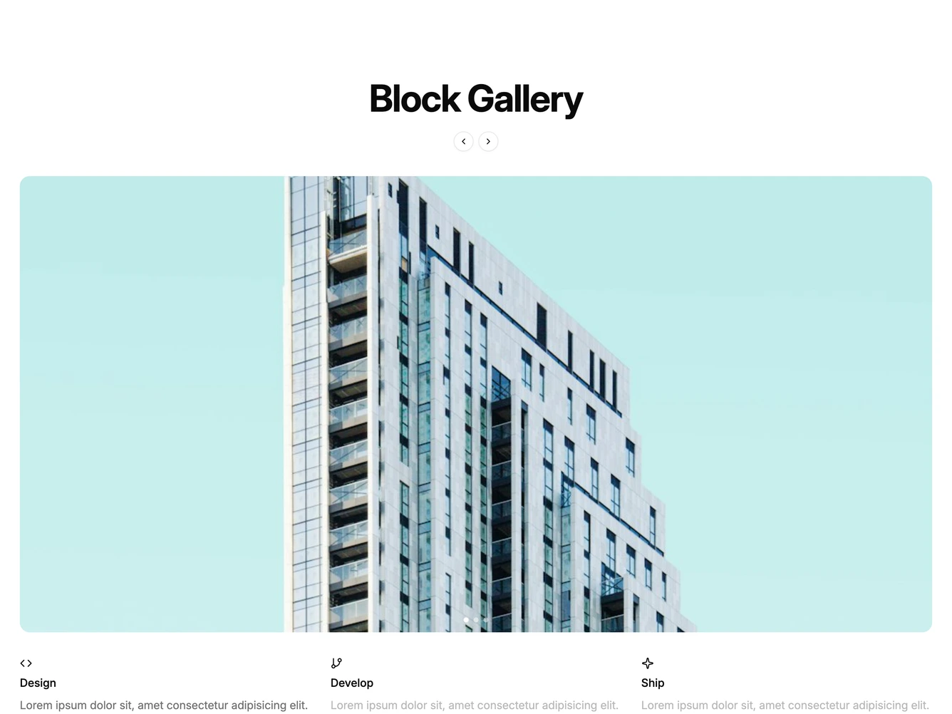
A centered Block Gallery heading sits above a full-width shadcn/ui Carousel that displays one rounded image per slide. Each image renders at a square aspect on mobile and a 2:1 landscape aspect on larger screens. Below the carousel on desktop, three clickable section summaries appear in a row, each showing a Lucide icon, a title, and a description. Clicking any section scrolls the carousel to the corresponding slide.
The active section's description renders at full muted-foreground opacity while inactive sections dim to half, providing a clear visual indicator of the current step. Small dot indicators sit over the bottom of the image and jump to any slide, while standard previous and next buttons sit statically under the centered heading rather than overlaid on the image. On mobile the section summaries move inline beneath each slide image instead of appearing in a shared row.
The structure follows a process-step pattern, presenting a small number of stages in sequence with large visuals and concise explanations. The clickable labels double as both navigation and content, keeping the interface compact while surfacing all steps at a glance.