
Feature 68 block design & features
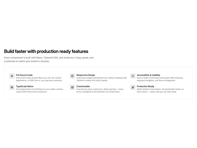
This block is built with shadcn/ui-friendly layout tokens: the story starts with a headline and explanatory paragraph occupying the plain page backdrop, followed by an inset surfaced panel rounding the corners and hugging six feature rows styled as icons inside soft primary-tint badges with adjacent titles and captions. Separation between intro and enumerated features is sharper than scattering icons directly on bare background.
Muted card surface with translucent border conveys a subdued canvas; icon wells use small tinted squares leading to tighter text stacks. Typography stays compact in the bullets so headline scale above still dominates vertically. Density inside the framed tray is snug but orderly; nothing animates prominently.
Interpretation skews pragmatic and handbook-like, less showroom than bordered marketing hero cards. Complexity is modest with balanced code versus content reliance: you need six differentiated icons plus parallel titles and explanatory strings. Compared with split-column icon sections, this reads as a single bounded facts grid.
The inner grid reflows from one column on phones to two on small tablets and three on broad desktops while the outer container keeps consistent padding.