Feature 67 block design & features
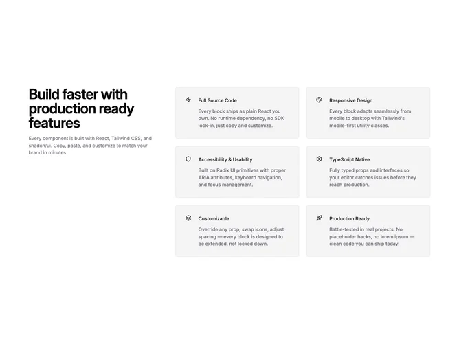
Feature67 organizes content built with Shadcn UI components into two regions on wide layouts: a left-aligned text stack for the headline and optional description, then a denser zone with six icon-led cards in two columns beneath the shared section width constraint. Icons render from your content props, typically lucide-compatible nodes, occupying a fixed gutter beside titles and explanatory lines. Cards share the same bordered accent styling so repetition reads intentional.
Muted accent fills and borders separate each cell from empty space rather than stacking flat on the page baseline. Typography keeps titles slightly heavier than muted body lines. Rhythm alternates tighter card interiors with corridor gaps from the sidebar column. Composition is deliberately editorial in how text leads before the enumerated rows.
Straightforward SaaS enumeration with clearer hierarchy than an icon-only grid jammed under one heading line. Complexity is modest and content-heavy: prepare six succinct titles plus descriptions plus matching glyphs. Suitable when you actually have six coherent points worth scanning in pairs.
Around extra-large breakpoints the headline column and cards sit horizontally; below that breakpoint the headline spans full width above the repeating card grid without losing readability.