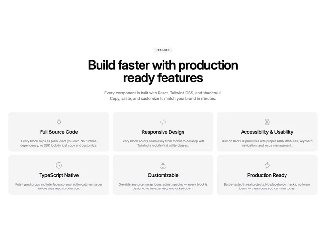
Feature 276 block design & features
Feature276 is a marketing feature grid built with shadcn/ui, centered with a pill label, large heading, supporting line, and a responsive card grid that grows to three columns on wide viewports. Each card carries a line icon, a short title, and a description, and hover tracks which card is active so the layout can emphasize one tile at a time.
The page background stays light while muted panels and hairline card surfaces keep the grid readable. Rounded corners on cards and the animated hover slab read as soft and product-marketing rather than stark. Motion is limited to the hover highlight and short fades, so the section feels interactive without constant movement.
Overall this is a polished, fairly standard feature grid with one clear twist: the shared hover backdrop that slides attention between items. Complexity is moderate and mostly motion-driven; you supply the label, heading, intro, and a bounded list of feature items with titles and copy.
On smaller breakpoints the grid stacks into one or two columns so icons and text remain legible without horizontal cramming.