Feature 354 block design & features
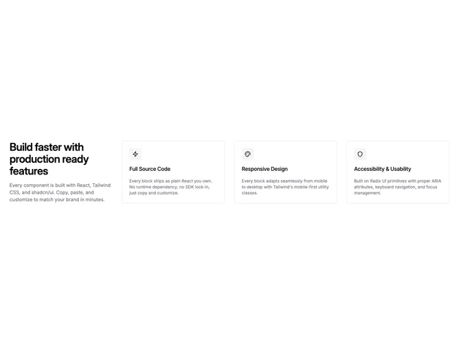
Feature354 is a shadcn/ui feature section that integrates the heading directly into the grid as its first cell, placing it alongside three bordered icon cards in a four-column layout. Each card contains a square icon badge, title, and description. On smaller screens the heading stacks above the cards.
The layout creates an asymmetric composition where the heading occupies the same visual plane as the feature cards rather than sitting above them. Cards use a subtle border with internal padding and muted icon badge backgrounds. The overall density is moderate with generous card padding.
This fills the grid-integrated-heading pattern with icons — a structural variant that previous blocks in this subgroup (feature35, feature42) achieved only without rendering icons. The Shadcn UI card style keeps it grounded and practical.