Feature 366 block design & features
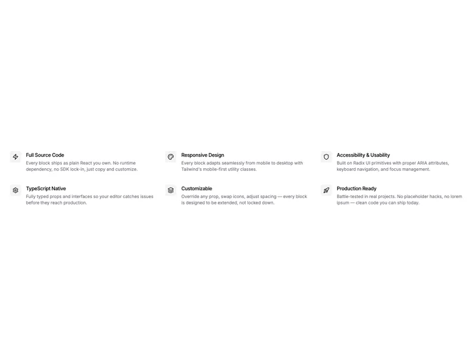
Feature366 is a minimal feature section built with shadcn/ui that arranges six items in a three-column grid. Each item places the icon badge inline to the left of the title and description, creating a horizontal reading flow. No section heading, no section description, no borders or card wrappers.
The inline layout gives each item a compact, list-like feel compared to the stacked icon-above-text pattern. Small square icon badges sit in a muted container with the title and description flowing alongside. Spacing between rows and columns keeps items distinct without any visible dividers.
This is one of the most space-efficient feature grid patterns. The horizontal icon-text pairing allows more items to fit without the vertical stacking overhead. A practical choice when you need to present many features in a compact area with zero decoration.