
Feature 16 block design & features
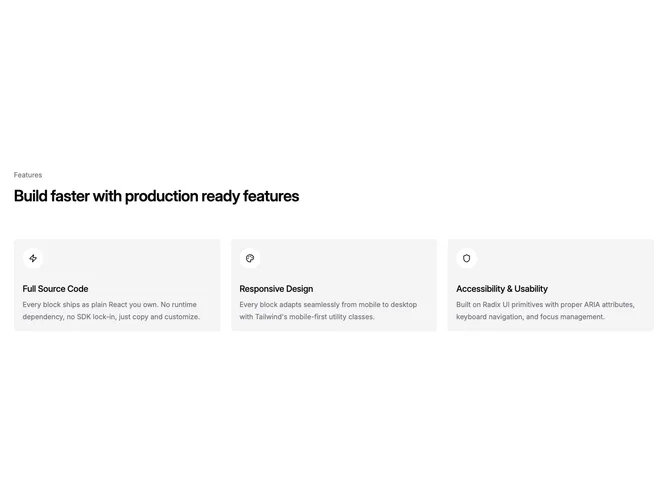
Feature16 is a basic pillar grid built into the marketing surface with Shadcn UI styling cues, arranging three rationale cards beside a sectional heading and eyebrow pattern. Cards pair circular Lucide glyphs with bold labels and explanatory paragraphs covering parallel claims such as performance, quality, and innovation.
Muted tint fills differentiate each tile while typography stays restrained, emphasizing legibility across the trio. Shadows or borders remain light so it reads approachable for starter sites.
Interpreted plainly, this is a straightforward “why choose us” strip that keeps three parallel claims at equal weight without carousel or tab overhead. Complexity stays low relative to animated hero bands.
Maintain parallel sentence structure so stacked cards scan evenly when columns collapse vertically on handheld widths.