
Feature 10 block design & features
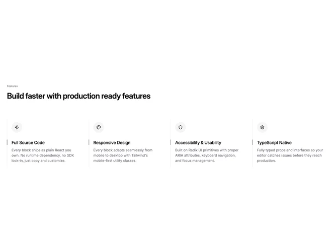
Feature10 is an icon-driven feature grid built with Shadcn UI-friendly structure and content from the feature-icon-list props model. A muted uppercase-style label can precede the main heading. Up to four features render in a responsive grid: one column on small screens, two on medium, four on large. Each tile shows an icon inside a circular accent-backed well, a short title, and a muted description, with a dashed vertical border accent on wider layouts plus a hairline marker tied to the heading.
The look is light, systematic, and modular: emphasis comes from circular icon chips and typographic hierarchy rather than photography. Density tightens as columns increase; padding and border-dashed segments give each column a defined lane. Hover behavior is minimal; the block reads as static marketing content.
Overall it is a corporate-neat icon checklist with a slightly technical flavor from monospace-adjacent cues and dashed rules. It differs from image-heavy features by relying entirely on icons and short copy. Developers supply icon nodes, titles, and descriptions for each slot.
Tiles wrap naturally; on narrow screens the dashed vertical treatment steps down so the list still reads cleanly as a stacked set.